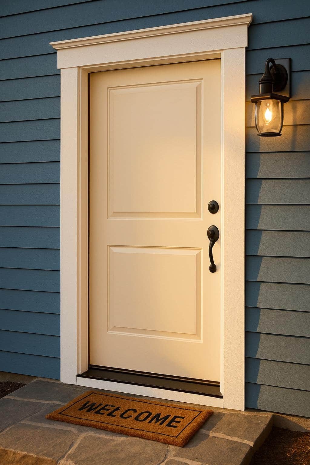
A front door sets the tone for the entire home, and when painted in Alabaster, it creates a warm and inviting entryway that feels timeless. An Alabaster front door offers a soft, neutral backdrop that pairs effortlessly with a wide range of siding colors and trim accents. This versatility makes it a reliable choice for both classic and modern exteriors.
Alabaster works well in different lighting conditions, bringing out subtle warmth in the morning sun and a calm glow in the evening. Its understated elegance allows surrounding design choices—whether bold siding or colorful accents—to stand out without clashing.
By exploring combinations such as slate blue siding, brick red walls, or olive green exteriors, it becomes clear how adaptable Alabaster can be. Each pairing highlights a different mood, showing how this shade can shift from crisp and clean to soft and welcoming depending on its setting.
Alabaster Door With Slate Blue Siding
An alabaster front door against slate blue siding highlights contrast, frames the entry with clarity, and responds well to natural light. This pairing balances warmth and coolness in a way that feels both modern and timeless.
Crisp Door Color Contrasts Against Slate Siding
An alabaster door stands out strongly against slate blue siding because the two colors sit on opposite ends of the lightness spectrum. The siding’s muted, cool undertones emphasize the creamy warmth of alabaster, making the entry naturally eye-catching.
This contrast works especially well on homes with clean architectural lines. The lighter door draws attention without overwhelming the façade, while the darker siding provides depth.
For homeowners who want a subtle yet defined focal point, this combination avoids the starkness of pure white but still reads as fresh. It works across architectural styles, from traditional to transitional, and pairs easily with natural accents like cedar or stone.
White Trim Frames The Entry Cleanly
Adding white trim around an alabaster door creates a layered effect that separates the door from the slate siding. The trim acts as a buffer, ensuring the door color doesn’t blend into the siding or appear washed out.
This detail also sharpens the geometry of the entry. Straight lines of trim emphasize door proportions and create a polished look.
Homeowners often choose a slightly brighter white for trim compared to the alabaster door. This subtle difference prevents the tones from merging and provides a crisp outline. The result is a clean frame that highlights both the siding and the door without distraction.
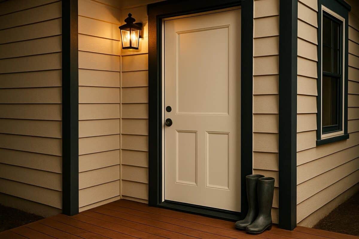
Golden Hour Light Enhances Warmth
When evening light hits alabaster, the door’s soft undertones become more noticeable. The creamy quality of the paint reflects warm light, making the entry appear inviting during late afternoon and sunset hours.
Slate blue siding, by contrast, tends to darken under the same conditions. This shift increases the perception of contrast, giving the door even more presence at the center of the façade.
For those who often notice their home in the evening—such as returning from work—the effect can be especially appealing. The door glows subtly, while the siding recedes, creating a balanced and welcoming transition from exterior to interior.
Crisp White Trim Against Brick Red Walls
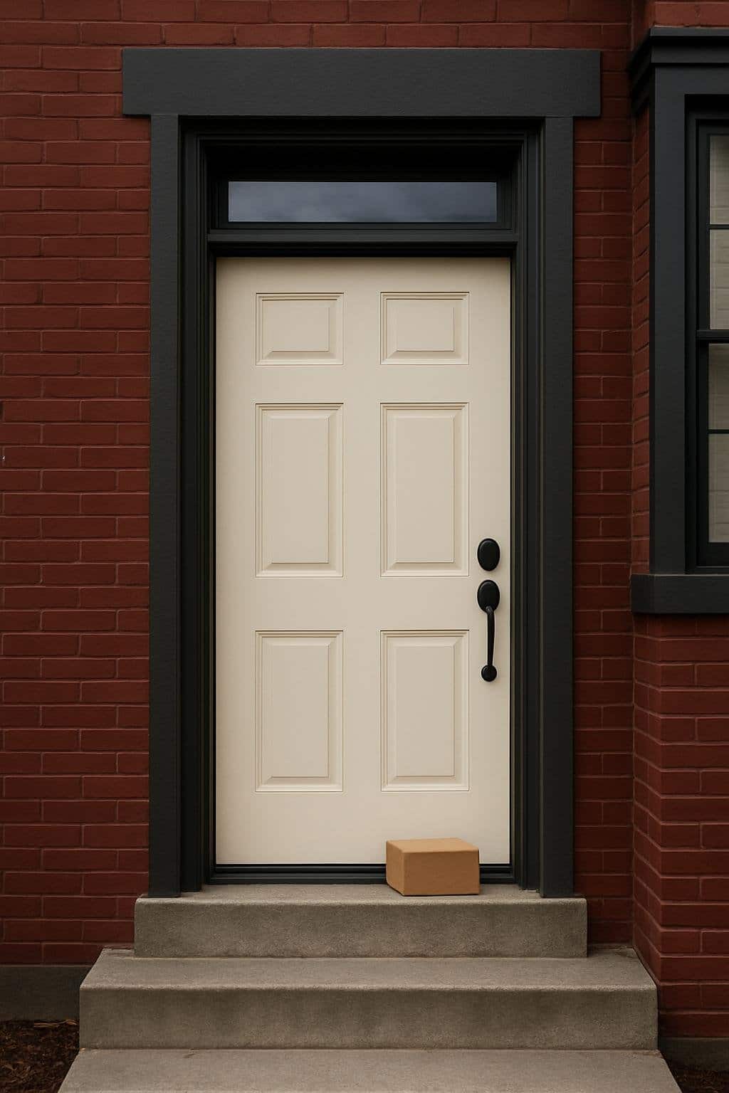
Pairing crisp white trim with red brick creates a balanced exterior that feels clean and intentional. The right door and trim colors influence how bold or subdued the brick appears, and natural light changes the effect throughout the day.
Alabaster Door Softens The Intensity Of Brick
An Alabaster-painted door introduces a soft, creamy white that tempers the strong tones of red brick. Unlike stark whites, Alabaster has a warm undertone that reduces contrast and prevents the entryway from appearing too harsh.
This choice works especially well when the brick leans toward an orange or brown base. The warmth in the paint aligns with the natural variation in the brick, creating a cohesive look.
Homeowners often use Alabaster for the door while keeping trim a brighter white for definition. This layered approach avoids monotony and highlights the architectural details.
A simple palette example:
| Element | Color Suggestion | Effect on Brick |
|---|---|---|
| Front Door | SW Alabaster | Softens contrast |
| Window Trim | Pure White or Cloud White | Defines edges |
| Shutters | Warm taupe or beige | Complements brick tone |
Dark Gray Trim Sharpens The Edges
When paired with red brick, dark gray trim provides a sharper outline that emphasizes structure. Colors such as Kendall Charcoal or similar deep grays create a strong frame around windows and doors.
This approach works well for homeowners seeking a more modern or tailored appearance. The gray acts as a neutral anchor, reducing the visual dominance of the brick while still allowing its texture to show.
Dark trim also contrasts effectively with a lighter door color like Alabaster. The combination of warm white and deep gray creates balance, ensuring the entryway feels deliberate rather than overly blended.
For a clean look, shutters or garage doors can repeat the gray trim. This repetition builds consistency across the façade and ties the palette together.
Cloudy Daylight Makes The Palette Rich And Moody
Natural light changes how brick and paint colors appear. On cloudy days, the red in brick often looks deeper, and whites like Alabaster shift toward a softer, muted tone.
This dimmer light enhances the moody side of the palette. The crisp white trim no longer feels bright but instead blends into the subdued atmosphere, while dark gray trim appears even more pronounced.
Homeowners should test paint samples outdoors at different times of day. A color that looks bright under direct sunlight may appear much heavier in overcast conditions.
By observing these shifts, they can confirm whether the chosen palette maintains the desired balance between warmth, contrast, and definition. This step helps avoid mismatched tones that only reveal themselves after the project is complete.
Evening Glow On A Neutral Entry
A tan or beige exterior gains warmth and balance when paired with a soft off-white door. Adding contrast through trim and enhancing the space with thoughtful lighting ensures the entry feels intentional, welcoming, and visually cohesive.
Beige Siding Pairs With An Alabaster Door Seamlessly
Beige siding provides a neutral backdrop that avoids the starkness of cooler tones. When matched with an Alabaster door, the pairing achieves a natural flow that feels soft yet defined. The door stands out enough to serve as a focal point without overpowering the exterior.
This combination works especially well in neighborhoods where natural earth tones dominate. The subtle beige undertones in Alabaster complement tan siding, preventing clashing undertones that can occur with pure bright whites.
Homeowners often choose this pairing because it adapts well to both traditional and transitional styles. Whether the siding has smooth panels or textured finishes, the Alabaster door maintains a consistent, balanced look.
Key benefit: This pairing creates a unified entry with warmth and subtle contrast, making the door noticeable but not harsh.
Black Trim Adds Modern Contrast
Adding black trim introduces a sharper edge to the entry design. Around an Alabaster door, black frames the lighter surface and emphasizes the clean lines of the doorway. This contrast delivers a modern touch while keeping the overall palette simple and neutral.
Black trim also works well with beige siding because it grounds the lighter tones. Instead of blending into the background, the entry gains definition that guides the eye directly to the door.
For durability, many opt for finishes such as satin or semi-gloss black paint on trim, which resists weathering and highlights architectural details. The combination of black trim, neutral siding, and an Alabaster door remains timeless and works across different architectural styles.
Practical tip: Use black sparingly on trim or shutters to avoid overwhelming the softer tones of the siding and door.
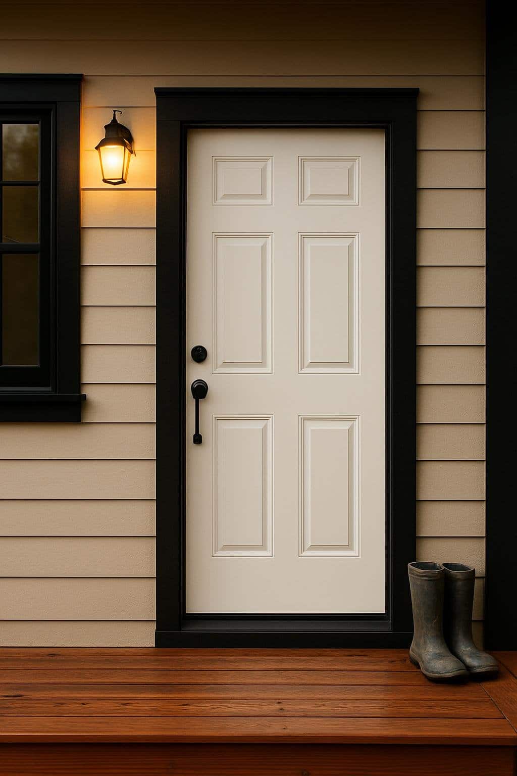
Evening Porch Light Creates A Welcoming Glow
Exterior lighting plays an important role in how colors appear after sunset. An Alabaster door under a warm-toned porch light takes on a soft, inviting glow that enhances its creamy undertones. This effect creates a welcoming impression for guests arriving in the evening.
Warm incandescent or LED bulbs in the 2700K–3000K range highlight the depth of Alabaster without making it look too yellow. Cooler bulbs can flatten the color and reduce warmth, so testing bulbs before installation is recommended.
Positioning also matters. A fixture mounted above or beside the door ensures even illumination and avoids harsh shadows. Black or bronze fixtures pair well with the trim, tying the entry elements together.
Lighting checklist:
- Choose warm color temperature bulbs
- Place fixtures to reduce glare
- Match fixture finish with trim for cohesion
This combination of color and light ensures the entry looks just as intentional at night as it does during the day.
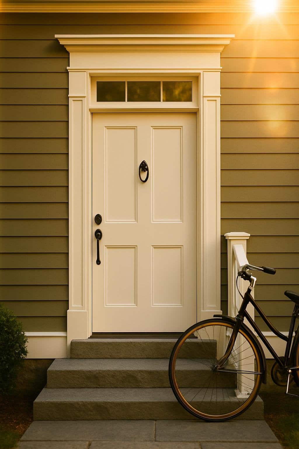
Olive Green Siding With Bright Alabaster Contrast
Pairing olive green siding with Alabaster trim creates a grounded yet crisp exterior. The muted green brings warmth and depth, while the soft white frames and accents provide definition and balance. Together, they establish a natural palette that feels both welcoming and refined.
Olive Siding Adds Earthy Balance
Olive green siding introduces a calm, organic tone that works well in both suburban and rural settings. Its muted quality avoids the harshness of darker greens while still offering enough color to stand out against neutral surroundings.
This siding color often pairs effectively with natural elements like stone, brick, or wood. The green’s earthy undertones connect the home to its environment, making landscaping and outdoor features feel more cohesive.
Olive also adapts well to seasonal changes. In spring and summer, it blends with foliage, while in fall and winter, it provides a steady backdrop against shifting colors. Homeowners who want a timeless look often choose olive because it resists feeling overly trendy.
White Trim Highlights Architectural Details
Alabaster trim frames windows, doors, and rooflines with clarity. Its warm undertones prevent the starkness of pure white, ensuring the contrast feels inviting rather than sharp. This makes it especially effective for homes with detailed trim or layered facades.
When used around windows and doors, Alabaster emphasizes symmetry and proportion. For homes with porches or columns, the trim highlights vertical and horizontal lines, adding definition without overpowering the siding.
A simple comparison shows its role clearly:
| Element | Olive Green Siding | Alabaster Trim |
|---|---|---|
| Walls | Soft, muted color | — |
| Doors/Windows | — | Framed accent |
| Architectural Lines | Subtle backdrop | Highlighted edges |
The pairing ensures the home feels structured yet approachable.
Golden Hour Lens Flare Adds Realism
Photographing this color combination during late afternoon light enhances its appeal. The golden hour softens the contrast between olive and Alabaster, creating a natural glow across surfaces. This lighting condition highlights texture in siding and trim without washing out details.
Warm light also brings out the subtle creaminess of Alabaster, preventing it from appearing flat. Shadows fall gently across the olive siding, giving depth to the overall appearance.
For design previews or real estate photography, capturing the home at this time of day produces a more accurate impression of how the colors interact in daily life. It shows the balance between earthy tones and bright accents in a realistic, approachable way.
Navy Trim And Wreath On A Cloudy Day
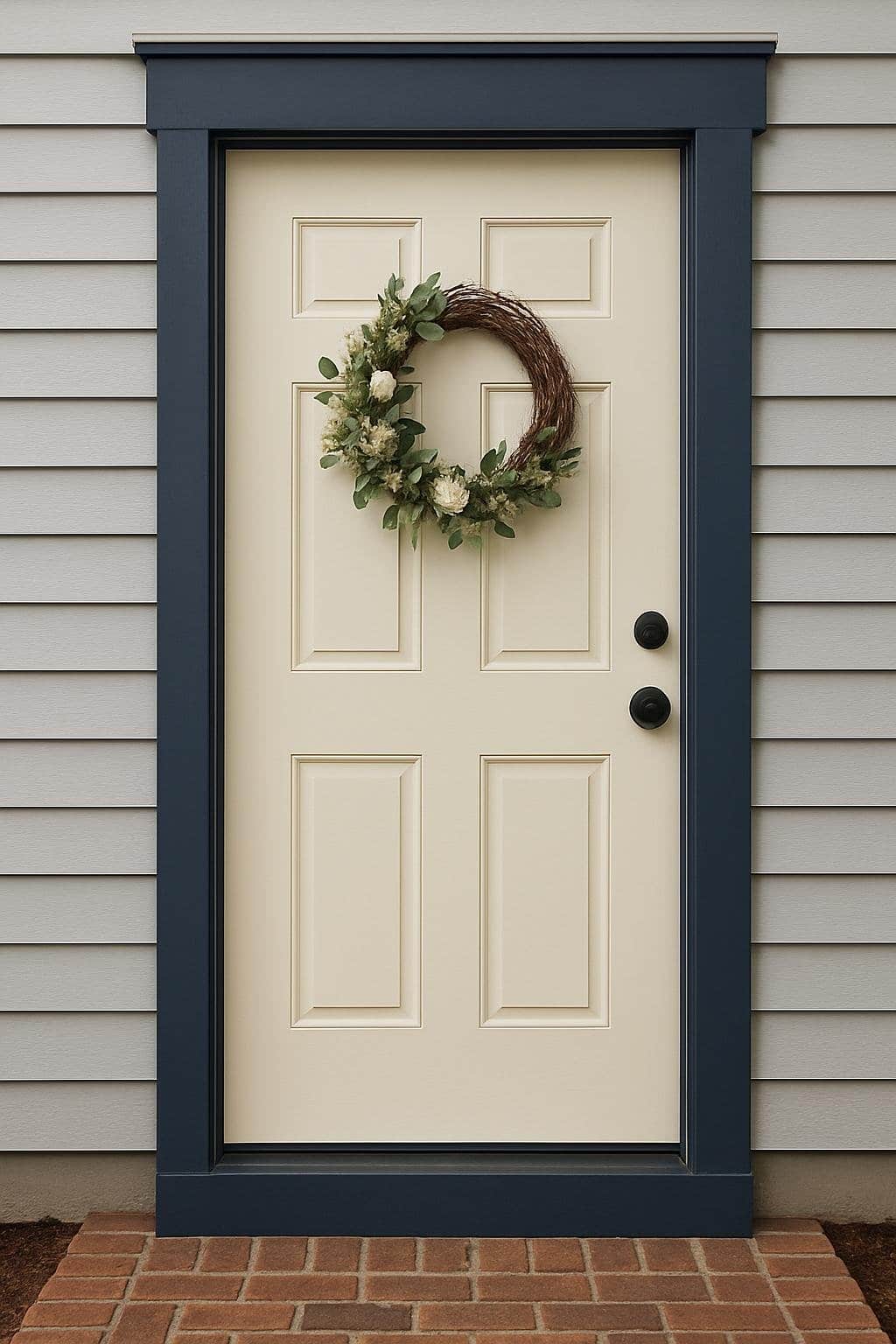
Navy trim introduces depth against softer exterior colors, while an alabaster door provides a bright focal point. A wreath adds texture and seasonal variation, helping the entry feel balanced and inviting even in muted daylight.
Light Gray Siding With Navy Trim Feels Classic
Pairing light gray siding with navy trim creates a timeless look that balances cool tones with a grounded contrast. The combination works especially well on cloudy days, when the navy appears rich rather than harsh.
Homeowners often choose navy for trim because it frames windows and doors with definition. Unlike black, which can feel stark, navy softens the edges without losing clarity. This makes it a practical choice for homes with neutral siding.
When selecting a gray siding, undertones matter. A cooler gray with subtle blue undertones complements navy trim more naturally than a warmer beige-gray. This prevents clashing and ensures the exterior feels cohesive.
A simple table can illustrate the effect of undertones:
| Siding Undertone | Works Well With Navy Trim | Less Compatible |
|---|---|---|
| Cool Blue-Gray | Yes | — |
| Neutral Gray | Yes | — |
| Warm Greige | Sometimes | Risk of clash |
Alabaster Door Pops As The Centerpiece
An alabaster front door becomes the natural focal point against navy trim and gray siding. Its soft white tone feels bright but not stark, which is important on overcast days when natural light is limited.
Unlike pure white, alabaster carries a slight warmth. This subtle quality prevents the door from looking flat against cool siding and trim. Instead, it creates a balanced highlight that draws the eye without overwhelming the entry.
Positioning is also key. When the trim and siding frame the door in darker tones, the alabaster finish acts almost like a spotlight. Visitors immediately notice the door, giving the entry a clean and intentional look.
For durability, satin or semi-gloss finishes are recommended since they resist dirt and are easier to clean.
A Wreath Softens The Entry With Seasonal Charm
Adding a wreath introduces texture and color, helping the doorway feel less rigid. On cloudy days, greenery or muted florals bring life to the neutral palette of gray, navy, and alabaster.
The wreath size should match the door’s scale. A 20–24 inch wreath typically fits a standard door without crowding the trim. Oversized pieces can overwhelm the alabaster surface, while smaller ones may look lost.
Seasonal materials keep the entry fresh. For fall, muted orange or rust accents pair well with navy trim. In winter, evergreen wreaths with subtle metallic touches provide contrast without clashing. Spring and summer allow lighter florals or woven textures.
A simple guideline helps with coordination:
- Cool seasons: Evergreens, berries, metallics
- Warm seasons: Florals, woven grass, light greenery
This approach ensures the wreath enhances the entry without detracting from the architectural colors.
Closing
Choosing a front door color with an Alabaster exterior depends on balance, contrast, and the desired mood. Since Alabaster is a warm, soft white, it works well with both muted and bold tones.
A darker door, such as charcoal, navy, or black, creates a strong focal point. These shades emphasize the crispness of Alabaster and add definition to the entryway.
For a softer look, sage green, pale blue, or warm wood stains provide a natural and welcoming appearance. These options blend with Alabaster’s warmth without overwhelming the exterior.
Some homeowners prefer brighter colors for personality and distinction. Red, teal, or mustard yellow can introduce energy while still complementing the neutral base.
| Door Color | Effect with Alabaster |
|---|---|
| Black/Navy | Bold contrast, formal |
| Sage/Blue | Calming, natural |
| Red/Teal | Energetic, inviting |
| Wood Stain | Warm, timeless |
Simple details like matching hardware, lighting, and porch accents help tie the door color to the rest of the exterior. This creates a cohesive look that feels intentional.
By focusing on tone, contrast, and surrounding details, homeowners can select a door color that works seamlessly with Alabaster while reflecting their preferred style.