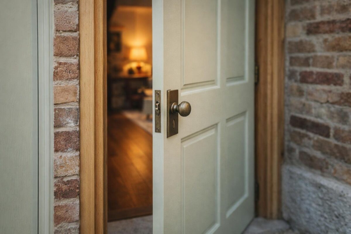
Your front door sets expectations before anyone steps inside. Color does more work than most details.
Sea Salt by Sherwin‑Williams blends soft green, blue, and gray tones that shift with light. This makes it a strong choice when you want personality without visual noise.
Sea Salt makes a clear statement across classic, modern, vintage, minimalist, and warm exterior door styles because it acts like a refined neutral with depth. You get contrast without harshness and color without overpowering the façade.
This article walks through how Sea Salt performs on doors that feel timeless and doors that lean modern. You’ll see how lighting, materials, and architectural lines change the way this color shows up on your entry.
Classy & Timeless Welcome
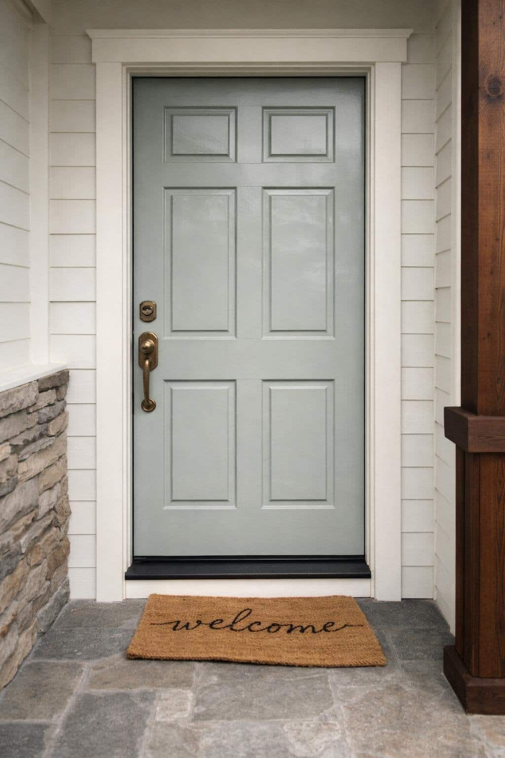
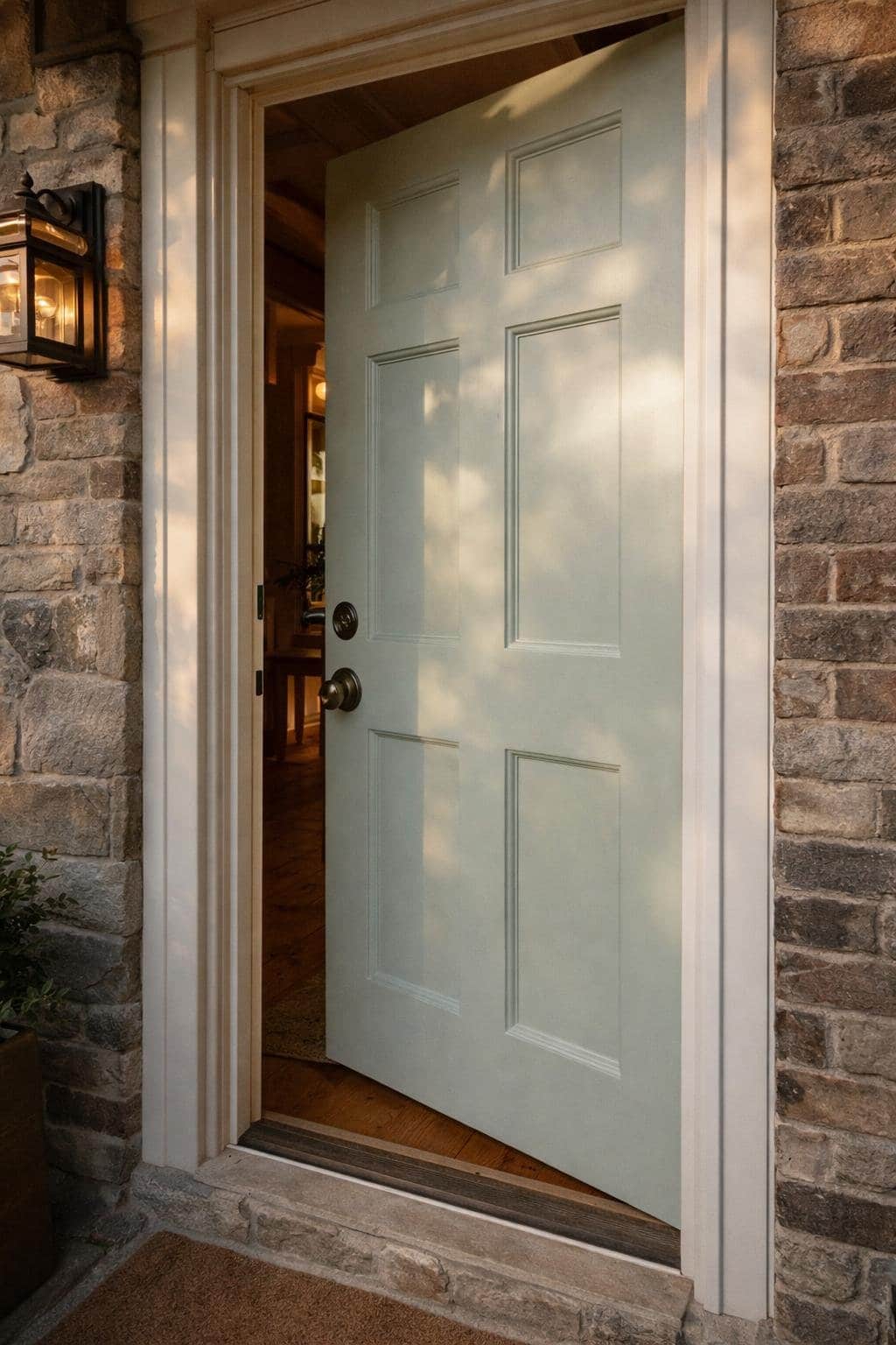
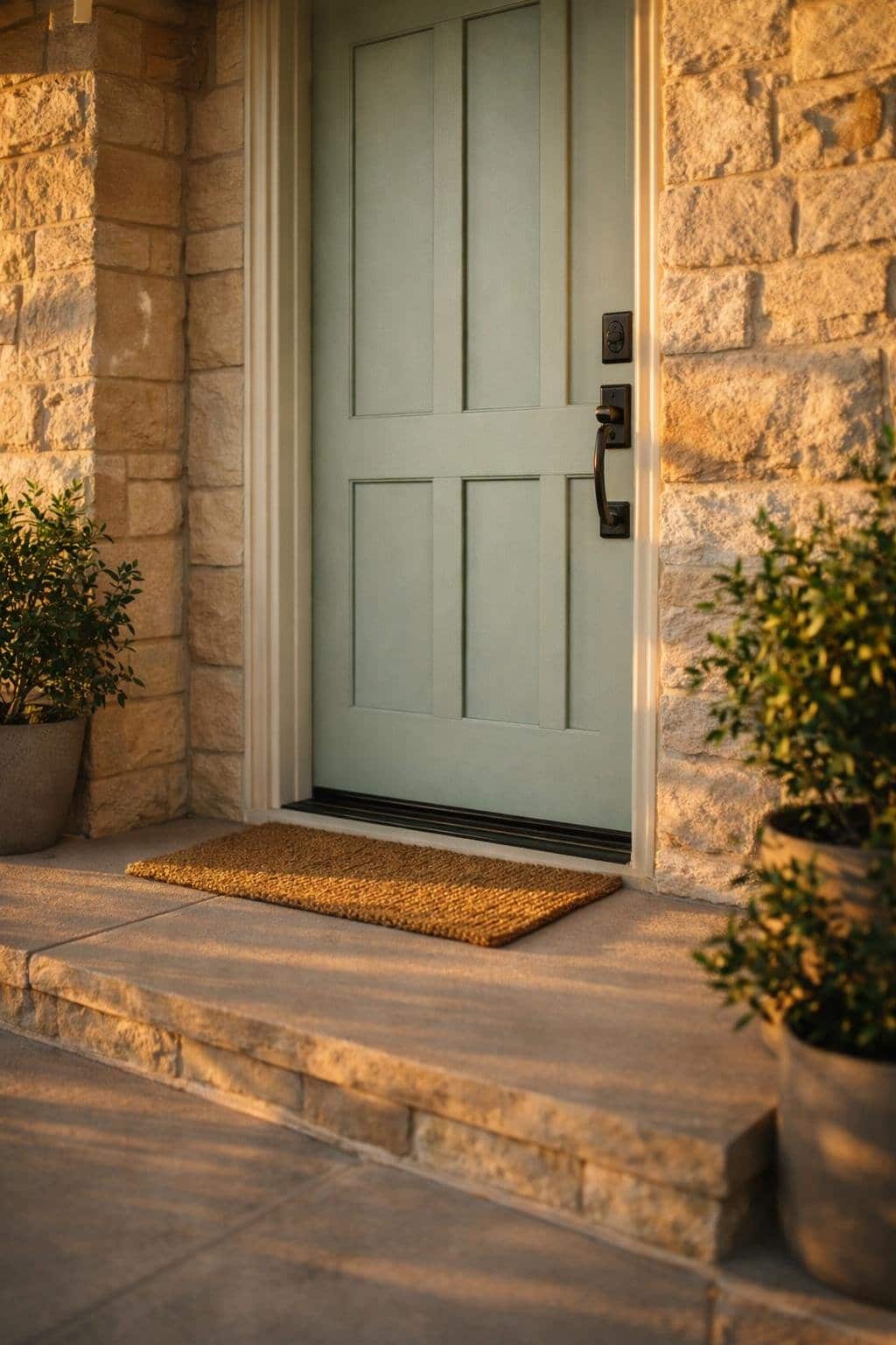
You create an elegant first impression when you choose Sea Salt by Sherwin‑Williams for a classic front door style. The color’s soft green‑gray base reads calm and intentional, not trendy.
It works especially well on paneled or craftsman-style doors with balanced proportions. Sea Salt stays neutral enough to complement traditional architecture.
It avoids stark contrast while still standing apart from white or beige siding. This balance helps your entry feel refined rather than decorative.
You can strengthen the timeless look by pairing the door with simple, high-contrast details. Clean hardware and restrained trim keep the focus on the color itself.
Design elements that support a classic look:
- Satin or semi‑gloss finish for subtle light reflection
- Brushed nickel, aged brass, or matte black hardware
- White or soft gray trim for clean definition
Lighting affects how Sea Salt appears throughout the day. In cooler or shaded conditions, it leans more gray and subdued.
In warmer light, you may notice a gentle green tone that adds depth without shifting the style.
The table below shows how Sea Salt performs in common traditional settings:
| Feature | Visual Effect |
|---|---|
| Raised wood panels | Emphasizes depth and detail |
| Symmetrical sidelights | Reinforces balance and formality |
| Neutral stone or brick | Keeps the entry grounded and cohesive |
Bold & Modern Curb Appeal
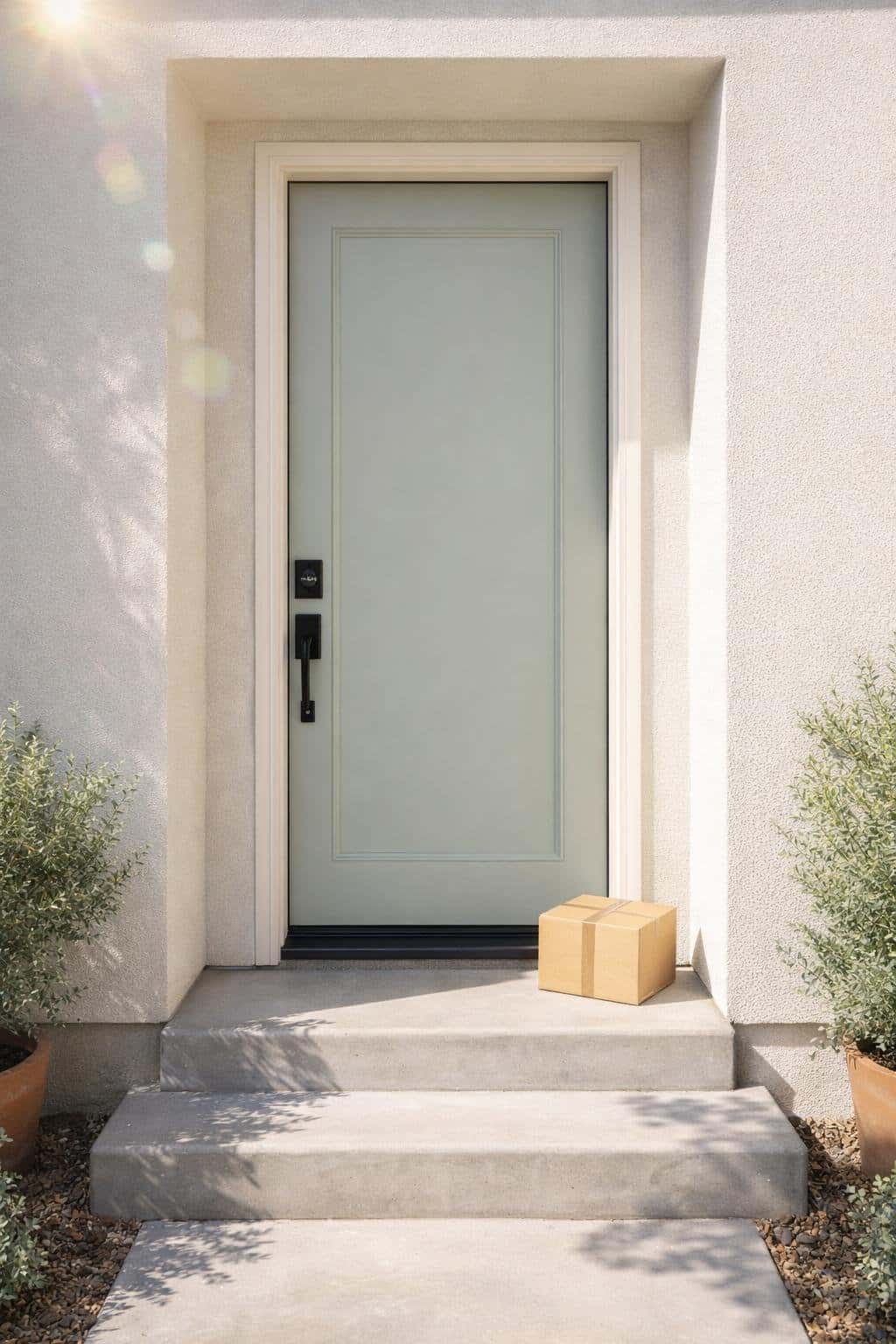
You get a clean, contemporary look when you pair Sea Salt by Sherwin‑Williams with modern front door styles. The color sits between soft green and gray, which keeps the entry calm while still noticeable.
It works well when you want curb appeal without sharp contrast. Flat‑panel and minimalist doors make the strongest impact with this color.
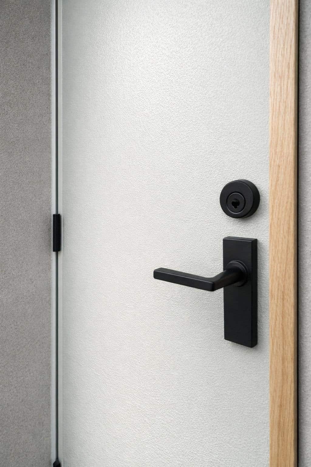
Simple lines let Sea Salt show its depth, especially in daylight. Black or brushed steel hardware adds structure without overpowering the finish.
You can increase visual interest by adding glass in controlled amounts. Narrow vertical lites or frosted panels bring in light while preserving privacy.
This approach suits modern and transitional homes.
Design elements that pair well with Sea Salt:
- Matte black or satin nickel hardware
- Smooth or lightly textured door surfaces
- Clear or frosted Low‑E glass inserts
- Light stone, concrete, or neutral siding
Material choice matters for modern curb appeal. Fiberglass doors hold color well and resist moisture, which helps maintain a consistent finish over time.
Steel works for protected entries but may need more upkeep in coastal or humid areas.
| Feature | Why It Works |
|---|---|
| Flat panels | Emphasize color over detail |
| Limited glass | Adds light without clutter |
| Dark hardware | Creates contrast and balance |
Vintage Character & Charm
You bring out vintage character when you pair Sea Salt by Sherwin‑Williams with classic door details. The color’s soft green‑gray base supports aged materials without overpowering them.
It suits homes where history and restraint matter more than contrast. You see this style work best on paneled wood doors, especially those with visible grain or subtle wear.
Sea Salt shifts between gray and green depending on light, which complements older façades that change throughout the day. The effect feels calm and intentional.
You can reinforce the vintage look with traditional hardware choices. Aged brass, oil‑rubbed bronze, or black iron add definition and keep the palette grounded.
Simple shapes work better than ornate designs.
Details that pair well with Sea Salt in vintage settings:
- Raised or recessed wood panels
- Divided‑light or leaded glass inserts
- Antique or reproduction door knockers
- Narrow sidelights with clear or seeded glass
You benefit from Sea Salt’s moderate light reflectance, which keeps older entryways from looking heavy. In shaded porches or recessed doors, the color leans slightly gray and reads more traditional.
In brighter light, a hint of green adds softness without looking trendy.
Minimalist & Architectural
You get a clean, modern look when you use Sea Salt on a minimalist or architectural front door. The color reads as a soft green‑blue‑gray, which keeps sharp lines from feeling harsh.
It adds definition without pulling attention away from the form of the door. This style works best with flat panels, flush slabs, or doors with subtle vertical grooves.
Sea Salt responds strongly to light, so its tone shifts with the time of day. In bright sun, it appears lighter and cooler; in shade, it leans more gray.
Design details that pair well with this style:
- Matte black or brushed stainless hardware
- Oversized handles instead of traditional knobs
- Hidden hinges or clean pivot systems
- Frosted or narrow vertical glass inserts
Trim choice matters in minimalist design. Crisp whites like Extra White or High Reflective White create clear contrast and reinforce the architectural lines.
Avoid creamy or yellow‑leaning whites, which can soften the effect too much. If your entry features concrete, stone, or smooth stucco, Sea Salt fits naturally into the palette.
The color supports modern materials without competing with them.
Warm & Golden‑Hour Glow
You get a softer, welcoming look when Sea Salt by Sherwin‑Williams meets late‑day light.
The color shifts gently under warm sun, picking up subtle green and blue notes without turning cold.
This balance helps your front door feel calm yet inviting as daylight fades.
You see the strongest effect on doors that catch west‑ or southwest‑facing light.
Wood grain, simple panels, and glass inserts reflect warmth and keep the color grounded.
Sea Salt stays composed, even when the light turns amber.
Details that enhance the glow:
- Brushed brass or aged bronze hardware to echo warm light
- Clear or lightly textured glass to diffuse reflections
- Natural stone or warm brick nearby to add contrast
You can also fine‑tune the effect with your finish choice.
Satin reflects enough light to highlight color shifts, while matte keeps the look quieter and modern.
| Element | Best Choice | Why It Works |
|---|---|---|
| Finish | Satin | Soft reflection, no glare |
| Hardware | Warm metals | Reinforces golden tones |
| Surround | Light neutrals | Keeps Sea Salt readable |