Sea Salt by Sherwin‑Williams shifts with light, furniture, and mood. This makes it a strong choice for living rooms that need flexibility.
You can use it to create warmth, depth, or calm without locking the space into a single style.
Sea Salt brings five living room styles to life by adapting to lighting, textures, and color accents while staying soft and balanced.
In bright daylight it feels airy and restrained. Evening light pulls out deeper green‑gray notes that add comfort and presence.
You’ll see how this color supports cozy evenings, low‑light drama, mid‑century warmth, soft daytime calm, and layered eclectic spaces.
Each style shows how Sea Salt responds to real conditions, not just paint chips. Your living room feels intentional at every hour.
Cozy, Evening Comfort
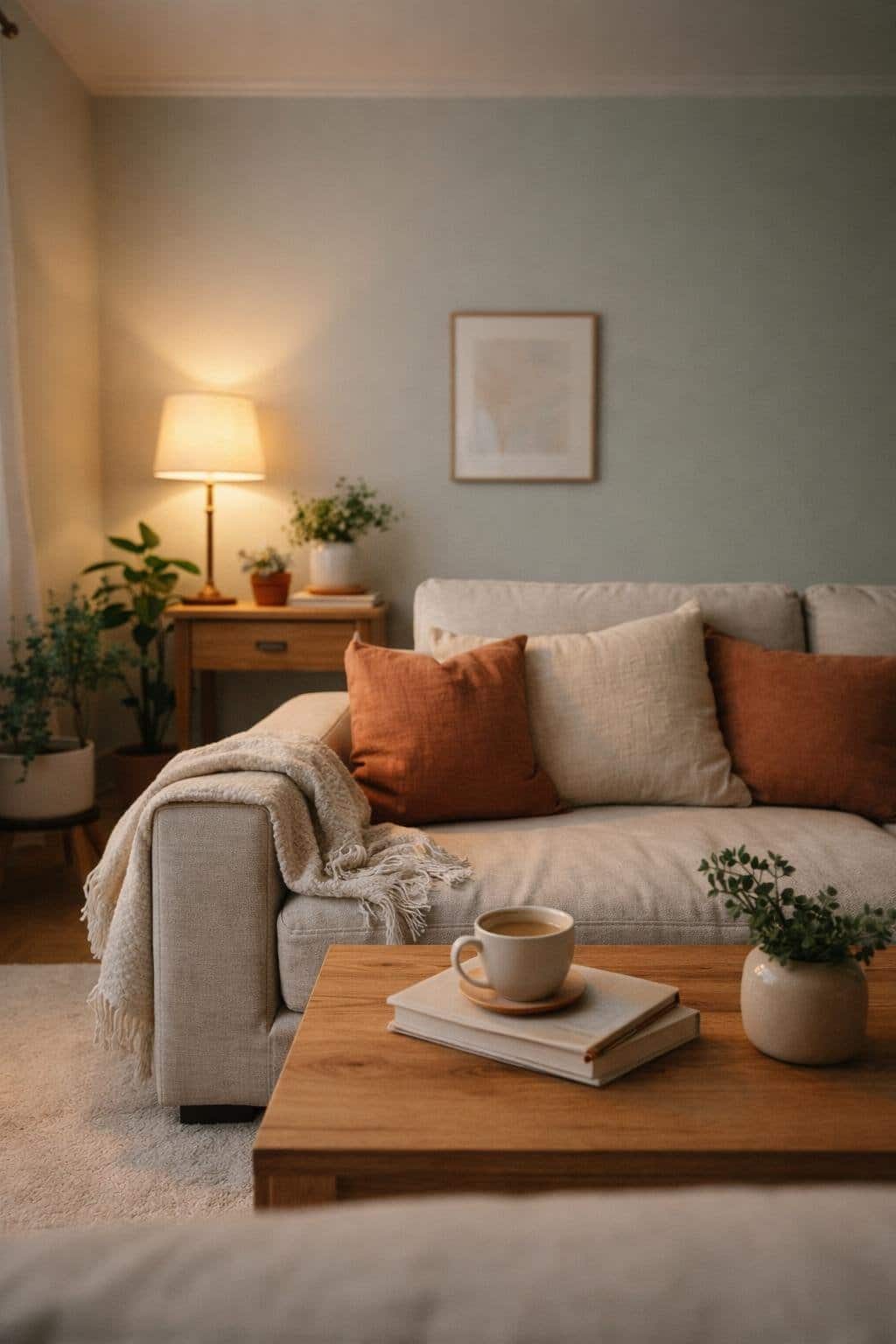
You create a calm, evening-ready living room when you pair Sea Salt by Sherwin‑Williams with soft textures and warm lighting.
The muted green‑gray tone settles into the background and supports relaxation without feeling cold or flat.
You strengthen the cozy effect with layered materials. Upholstered seating, woven throws, and low‑pile rugs add comfort while keeping the room visually simple.
Natural fabrics like cotton, wool, and linen work especially well against Sea Salt’s balanced undertone.
You control the mood through lighting. Table lamps, floor lamps, and wall sconces with warm bulbs soften the space and reduce glare.
Avoid relying on overhead lighting alone, especially at night.
Elements that support evening comfort:
- Warm wood finishes in oak or walnut
- Slipcovered or overstuffed seating
- Accent pillows in beige, clay, or muted blue
- Curtains that filter light rather than block it
You keep the room grounded by limiting contrast. Sea Salt pairs best with warm neutrals and subtle patterns, not sharp blacks or bright whites.
A fireplace, real or faux, fits naturally into this palette and reinforces the sense of comfort.
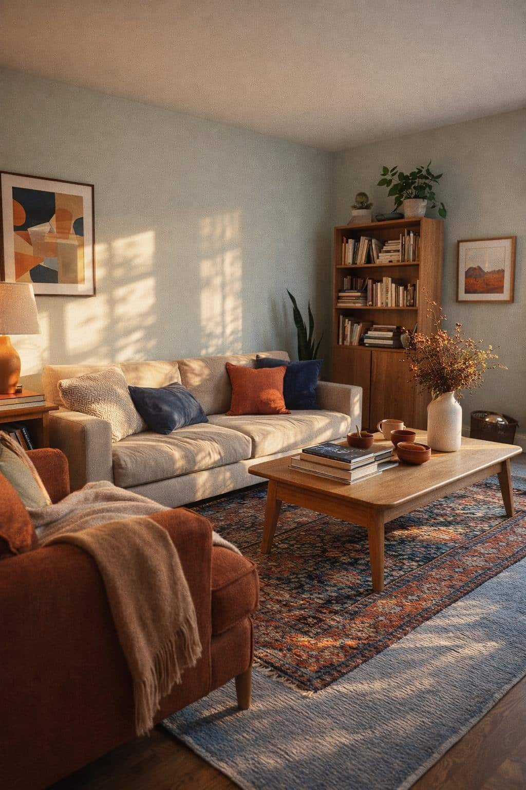
Moody, Low‑Light Drama
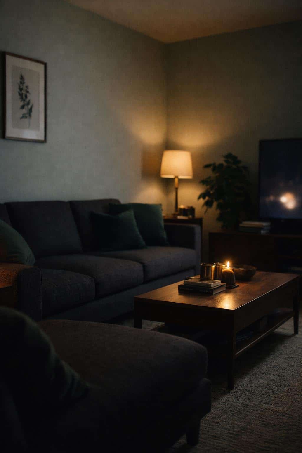
You can use Sea Salt by Sherwin‑Williams to soften a moody living room without losing depth. In low light, this blue‑green gray reads calm and grounded, not cold.
It balances shadowy corners while keeping the room visually connected.
You get the best results when you pair Sea Salt with darker anchors.
Charcoal upholstery, deep wood tones, or blackened metal frames add contrast and structure. The wall color holds the space together instead of competing with the drama.
Lighting choices matter. Warm bulbs prevent the color from turning flat or washed out.
You want glow, not glare.
- Use floor lamps with fabric shades
- Add wall sconces to layer light
- Avoid bright white bulbs
Texture keeps the room from feeling heavy. You can layer materials to add interest without adding visual noise.
| Element | Why It Works with Sea Salt |
|---|---|
| Velvet or boucle seating | Softens shadows |
| Matte black accents | Sharpens contrast |
| Aged brass details | Adds warmth |
You can also let artwork do more of the talking. Moody photography or abstract pieces with muted blues and greens echo the wall color.
Mid‑Century Warmth
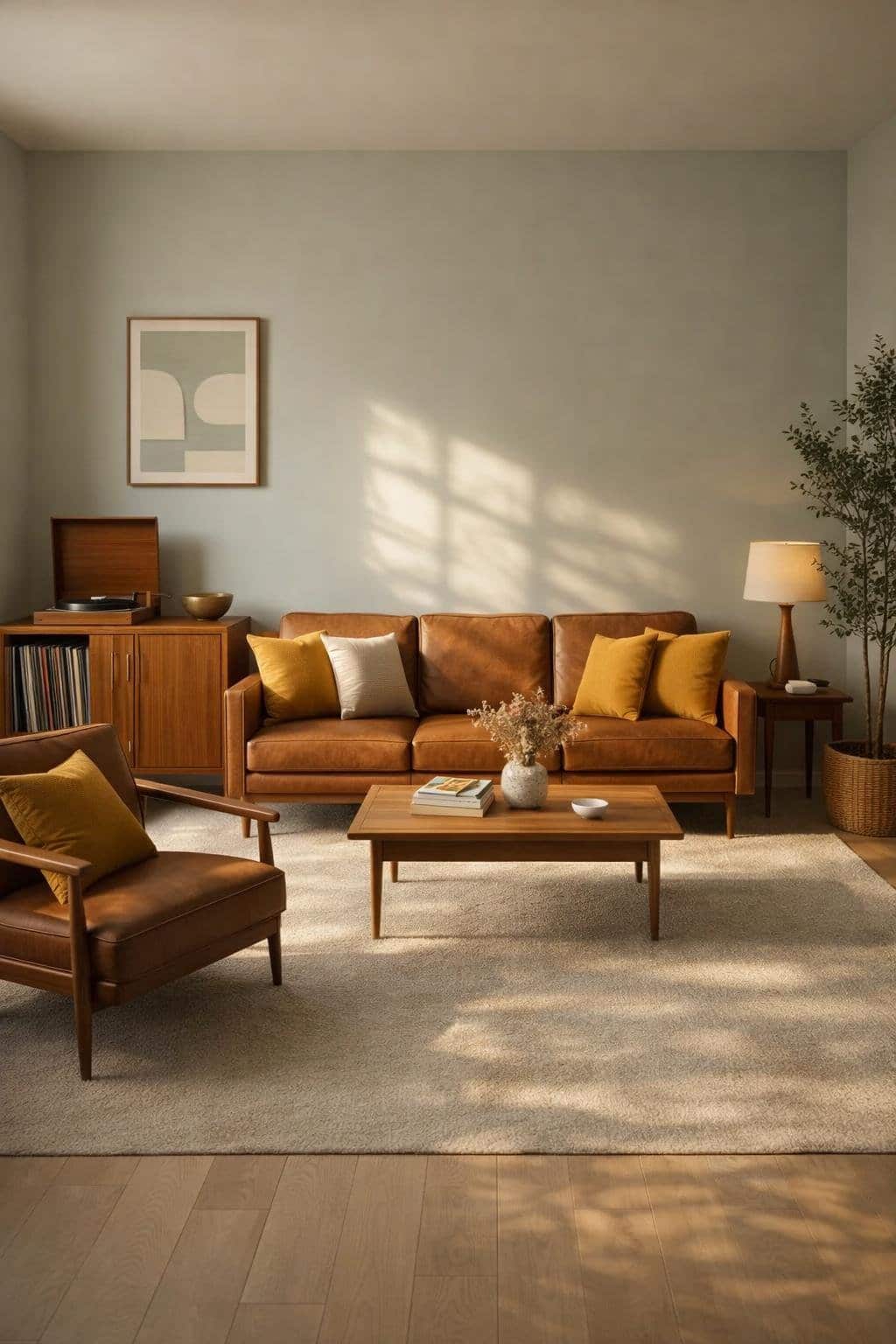
Sea Salt by Sherwin‑Williams gives mid‑century modern spaces a calm backdrop that softens clean lines and geometric forms.
You get the airy feel of a neutral without losing the warmth this style needs to feel inviting.
You can pair Sea Salt with natural wood tones, especially walnut or teak, to anchor the room.
Leather seating, woven textiles, and low‑profile furniture reinforce the era’s functional design while keeping the palette relaxed.
To keep the look grounded, focus on contrast rather than color overload. Sea Salt works best when you balance it with deeper accents and tactile materials.
Mid‑century elements that work well with Sea Salt:
- Tapered wood furniture and exposed legs
- Geometric or kidney‑shaped coffee tables
- Simple window treatments with clean lines
- Sculptural lighting in brass or bronze finishes
Lighting matters in this style. You benefit from warm bulbs and statement fixtures that highlight form without overpowering the room.
A single oversized pendant or sputnik‑style chandelier adds structure against the soft wall color.
Use color sparingly but intentionally. Muted greens, warm browns, and soft terracotta accents align with mid‑century palettes and sit comfortably against Sea Salt.
| Element | Recommended Direction |
|---|---|
| Furniture | Low, streamlined, wood‑forward |
| Textiles | Wool, leather, woven fabrics |
| Accent colors | Sage, camel, rust |
| Finishes | Brass, wood, matte black |
Serene, Soft‑Daylight Calm
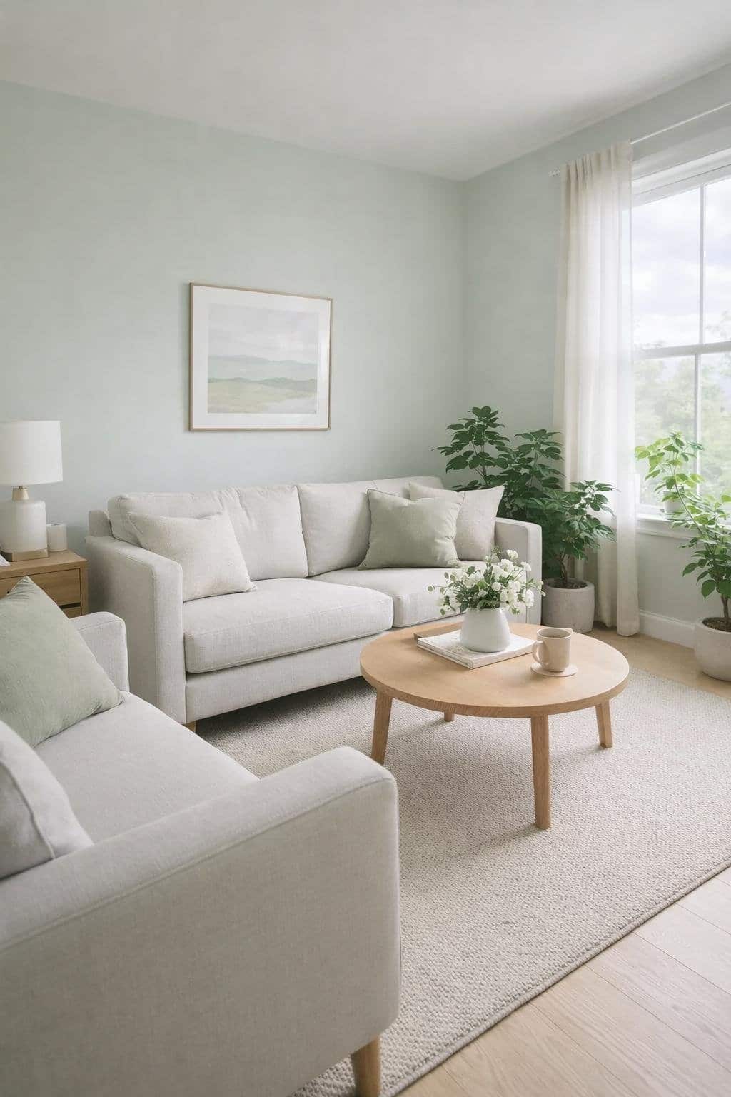
You get the best results with Sea Salt when soft daylight fills the room. The color sits between green, blue, and gray, so natural light keeps it balanced and readable.
In most living rooms, it reads calm without looking flat or cold.
You can rely on Sea Salt’s light reflectance value of about 64 to help the space feel open.
It reflects daylight well, which supports a relaxed mood without turning the walls stark.
North‑facing rooms lean slightly gray, while south‑facing rooms bring out gentle green notes.
This style works best when you keep surrounding elements quiet and intentional. Clean lines and restrained contrast let the color do its job.
Design choices that support this look:
- Soft white or off‑white trim
- Light wood floors or pale rugs
- Linen, cotton, or wool upholstery
- Minimal wall decor with muted tones
You should avoid strong color competition. Deep reds, bold yellows, or high‑contrast black can disrupt the calm effect Sea Salt creates in daylight.
If you want structure without heaviness, pair the walls with pale greige or warm white furniture.
This keeps the room grounded while allowing the light to move naturally across the space.
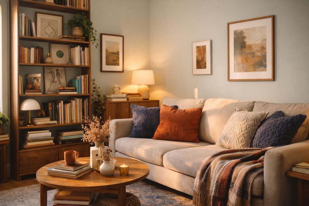
Eclectic, Layered Character
You create an eclectic living room by combining pieces that feel collected over time. Sea Salt by Sherwin‑Williams supports this approach with a soft, muted tone that keeps visual variety from feeling chaotic.
The color reads calm, but never flat. This helps different styles coexist.
You can mix vintage furniture, modern accents, and global details without competing for attention.
Sea Salt works as a unifying backdrop, allowing bolder elements like patterned rugs or statement art to stand out. It also pairs well with both warm and cool finishes.
You add depth through layers rather than matching sets. Textiles, art, and lighting each play a role in shaping the room’s character.
Common elements that work well with Sea Salt:
- Patterned or Persian-style area rugs
- Mixed-material furniture, such as wood and metal
- Bold or oversized artwork
- Layered lighting with table and floor lamps
You benefit from how Sea Salt shifts subtly with light. In brighter rooms, it feels airy and fresh.
In lower light, it leans slightly warmer, which complements textured fabrics and collected décor.
You maintain balance by letting a few pieces lead while others support. Sea Salt gives you that flexibility.