Finding the right paint color can really make or break a home office. Agreeable Gray gives you a balanced backdrop that works with many styles, from modern and minimalist to cozy and inviting.
This soft tone sets up a workspace that feels professional but still comfortable. It’s amazing how much color can affect the mood of a room.
Shape your office into a space that supports focus and still shows your personal style. Whether you want something sleek or more inviting, Agreeable Gray adapts easily to your needs.
Cool
Pair Agreeable Gray walls with a walnut desk for a cool, balanced vibe. The wood’s warmth pops against the soft gray, so the space won’t feel flat.
This mix grounds your office and adds a bit of style. Matte black shelving brings in a modern edge, standing out against the neutral walls and adding some depth.
Use those shelves for books, plants, or whatever you like. Lighting helps keep the cool look going—natural light highlights the gray, and a black desk lamp or pendant echoes the shelving.
You really don’t need much extra color. Maybe just a muted accent, like a blue chair cushion or a gray rug, to keep things looking clean and cohesive.
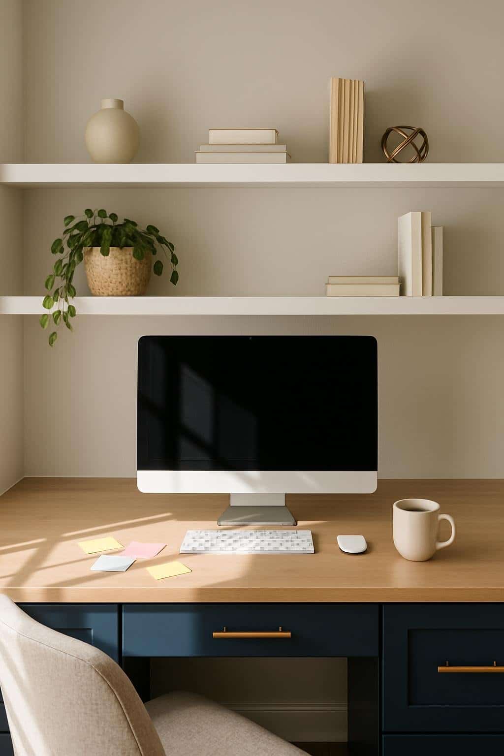
Stylish
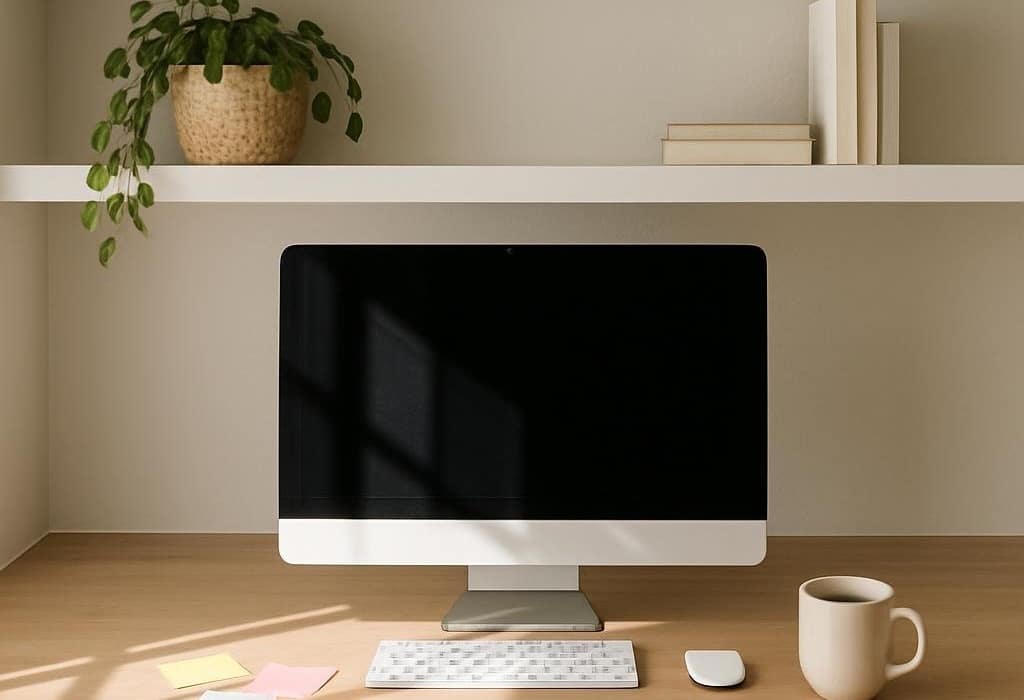
Pair Agreeable Gray walls with sage green bookshelves for a stylish office. The gray keeps things calm, while the green adds color without being too much.
Oak flooring works beautifully here, adding natural warmth to balance the cooler shades. Keep the floor simple or toss down a neutral rug for comfort.
Don’t just fill the shelves with books—add a few plants or decorative pieces for texture. The green shelves let you highlight items but still blend with the gray walls.
Want more brightness? Go for light-colored furniture or white trim. A simple desk and chair in neutral tones help tie everything together.
Modern
If you’re after a modern office, Agreeable Gray gives you a clean, neutral base. The soft gray works with straight lines and uncluttered layouts, helping the space feel calm without being boring.
Try navy cabinetry for depth and contrast. The darker blue stands out against the gray, creating a balanced, modern look that feels polished but not stiff.
Brass accents—on cabinets, lights, or desk accessories—bring warmth and a little shine. These touches stop the space from feeling too cold and add some personality.
Lighting makes a difference. Natural light brightens the gray, while warm bulbs highlight the navy and brass. You can get a space that’s both stylish and practical with just a few tweaks.
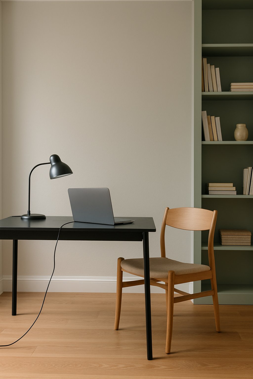
Minimalist
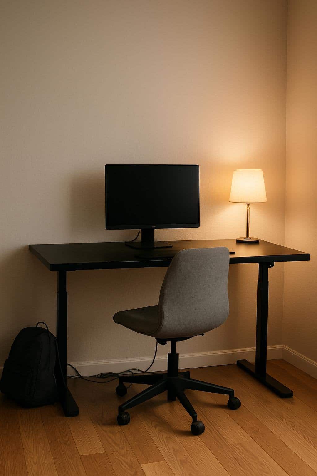
A minimalist office works great with Agreeable Gray. The color feels calm and balanced, so you don’t need much decor to make it feel finished.
The soft gray walls give you a clean backdrop and help you focus. Try a black standing desk to anchor the room—the dark surface contrasts with the light walls and adds structure without being heavy.
Standing desks also keep things practical and flexible. Oak floors warm up the space, softening the gray and black for a look that’s inviting, not stark.
Stick to a few simple pieces, like a chair with clean lines or a small plant. With fewer objects, the room feels easier to use and maintain.
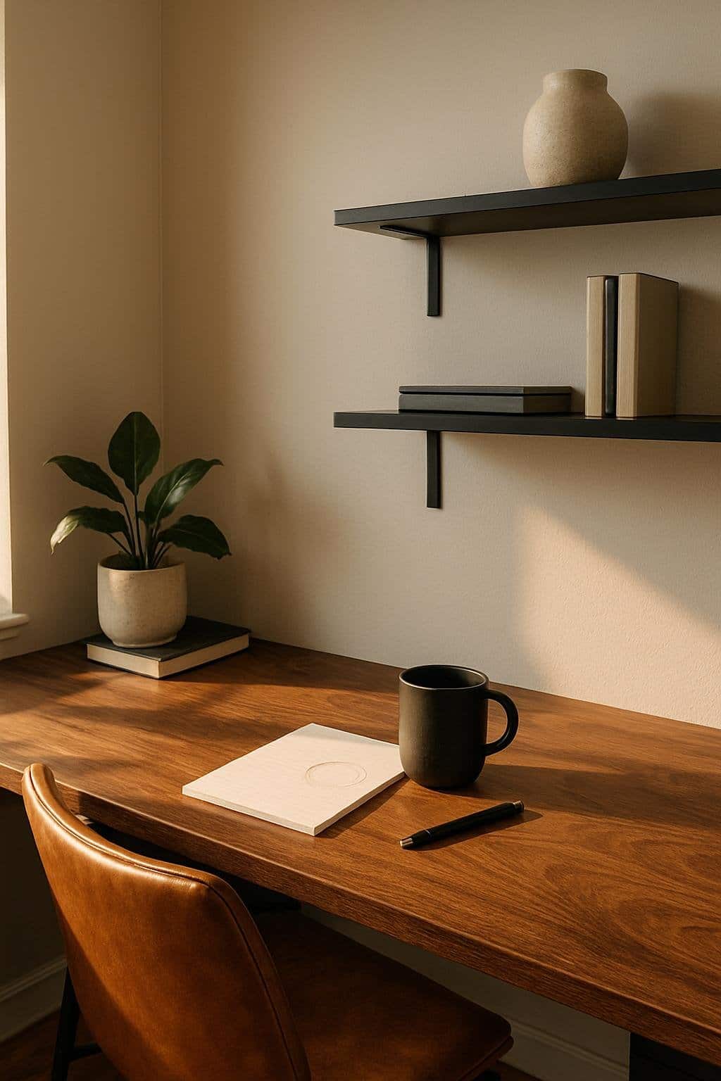
Cozy
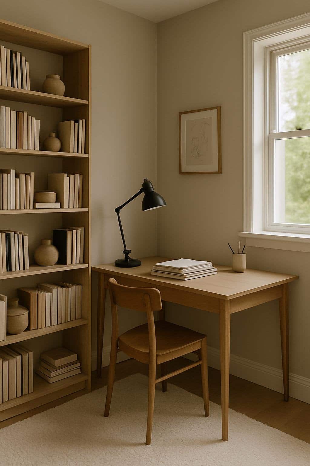
Agreeable Gray on your office walls gives the space a soft, inviting vibe. The neutral tone keeps things calm and makes it easier to focus without feeling boxed in.
Pine shelving adds warmth and a bit of natural texture. The light wood balances the gray, making the office feel more comfortable.
Use the shelves for books, plants, or personal items. A cream rug under the desk adds another layer of coziness and blends well with the gray and pine.
The soft rug makes the space warmer underfoot, which feels pretty nice during long work hours.
Why Agreeable Gray Works for Home Offices
This color creates a calm backdrop that feels professional but not boring. It blends easily with different furniture styles and accent colors, so you have plenty of flexibility.
The Psychology of Neutral Colors
Neutral colors like Agreeable Gray help you feel balanced while working. Gray tones often reduce visual clutter, which can make your space feel more open and less distracting.
The slight warmth in this shade keeps the room from looking cold or sterile. You might notice it creates a sense of stability, too.
Unlike bright or bold colors, it won’t compete for attention, so your focus stays on your tasks. That’s especially helpful if you spend all day in your office.
Agreeable Gray pairs well with warm or cool accents. You can add natural wood, white trim, or darker tones and it still looks right. That kind of flexibility makes it easy to keep your office calm but personal.
Enhancing Productivity with Color Choice
The color of your workspace really affects how you work. Agreeable Gray encourages focus by giving you a soothing background that doesn’t overstimulate your eyes.
This makes it easier to stay on track during long projects. Try using this shade on the main walls, then add accents in colors that boost energy or creativity.
- Blue accents for concentration
- Green tones for calmness
- Indigo or navy for depth and structure
Agreeable Gray as a base keeps your office consistent, but you can still layer in supportive colors. This balance helps you feel relaxed and motivated throughout the day.
Styling Tips for Agreeable Gray Spaces
Agreeable Gray works best when you balance it with the right colors and lighting. Small design choices—accent tones, lighting setups—can totally change how the shade feels in your office.
Pairing with Accent Colors
Agreeable Gray has a warm undertone, so it plays nicely with both cool and warm accents. Try soft blues or deep greens for a calm look, or add burnt orange and mustard yellow for warmth.
If you want a more professional vibe, stick with navy, charcoal, or black accents for clean contrast.
Mix in textures to keep things from looking flat. For example:
- Wood finishes add warmth
- Metal accents like brass or matte black add structure
- Textiles such as linen or velvet soften the space
Testing colors with small items—throw pillows, desk chairs, art—lets you see what works with the gray before you commit to bigger pieces. Honestly, it’s a low-risk way to experiment and keep the space feeling fresh.
Choosing the Right Lighting
Lighting really changes how Agreeable Gray appears as the day goes on. Depending on where your windows face, natural light can make the color feel warmer or cooler.
North-facing rooms tend to pull out the cooler side of Agreeable Gray. If your windows face south, you’ll probably notice the color looking a bit warmer and softer.
If you’re using artificial light, try soft white bulbs (2700K–3000K) for a cozy vibe. For a workspace that needs more energy, daylight bulbs (4000K–5000K) do the trick.
Mixing up your light sources helps too. You might want to use:
- Overhead lighting for that all-around glow
- Desk lamps when you need to focus
- Floor or wall lamps to add a little depth and balance
Honestly, it’s smart to test a few bulbs in your space before you commit. It’s surprising how much a simple lighting tweak can change the way Agreeable Gray shows up on your walls.