You want an exterior color that feels calm, current, and flexible across design styles. Sherwin‑Williams Sea Salt delivers a soft blue‑green with gray undertones that adapts well to light, materials, and architectural detail.
IIt creates a balanced look that feels fresh without looking trendy.
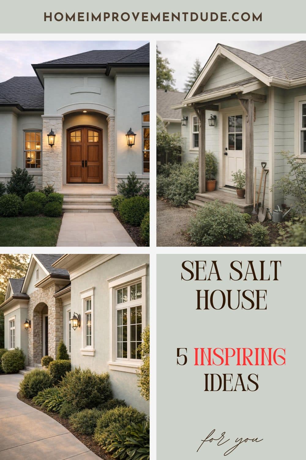
Sea Salt looks its best on modern luxury homes, cozy cottage‑style exteriors, minimalist architecture, warm coastal or farmhouse designs, and refined transitional homes with strong lighting. The color shifts gently throughout the day, which helps these styles maintain depth and visual interest without overpowering the structure.
This article explores how Sea Salt supports clean lines, relaxed textures, and polished details depending on the exterior style you choose. You will see how the same color can feel crisp in daylight, warm in sun‑washed settings, and composed under evening lighting.
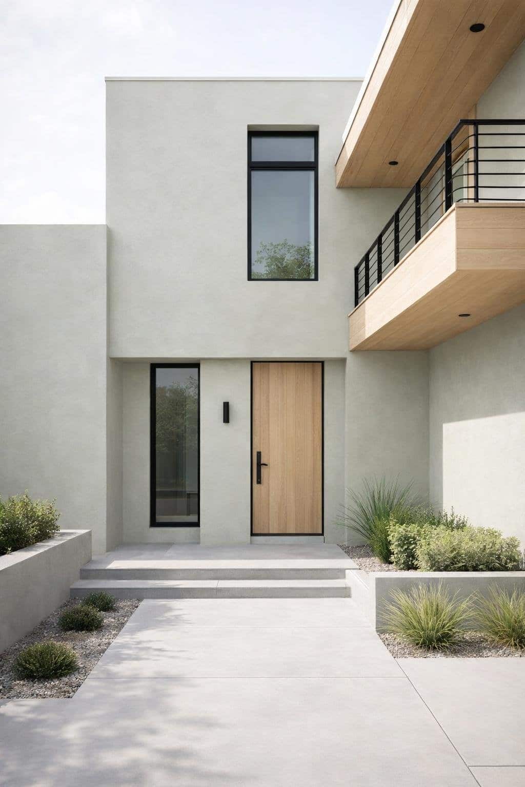
Modern Luxury Presence
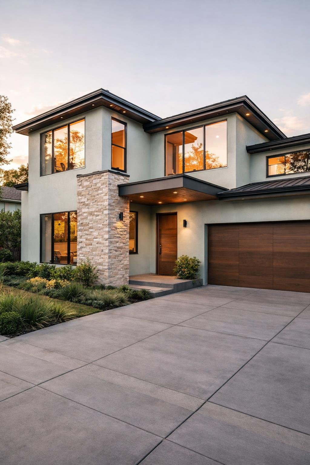
Sea Salt brings restraint and polish to modern luxury exteriors. You get a soft green‑blue tone that reads calm and intentional rather than bold, which suits clean lines and precise architecture.
You often see the best results on flat or low‑slope roofs, large window walls, and smooth stucco or fiber‑cement siding. Sea Salt keeps the exterior light and composed while allowing form and proportion to lead.
Design elements that strengthen the look:
- Matte black or dark bronze window frames
- Minimal trim in Alabaster or Spare White
- Natural stone or large‑format concrete accents
Sea Salt also works well with contrast. Pair it with deep tones like Naval or Sea Serpent on doors, gates, or architectural panels to add depth without overpowering the facade.
| Feature | Recommended Pairing |
|---|---|
| Trim | Alabaster, Spare White |
| Accent color | Naval, Pewter Green |
| Materials | Glass, steel, limestone |
Lighting plays a critical role. You should use warm, focused exterior lighting to prevent Sea Salt from reading too cool at night and to highlight architectural planes.
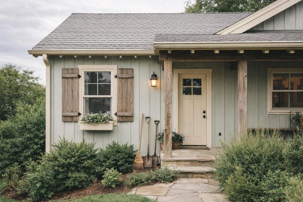
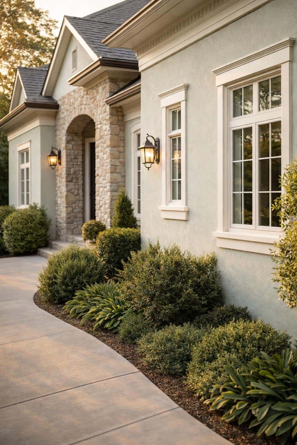
Cozy, Lived-In Charm
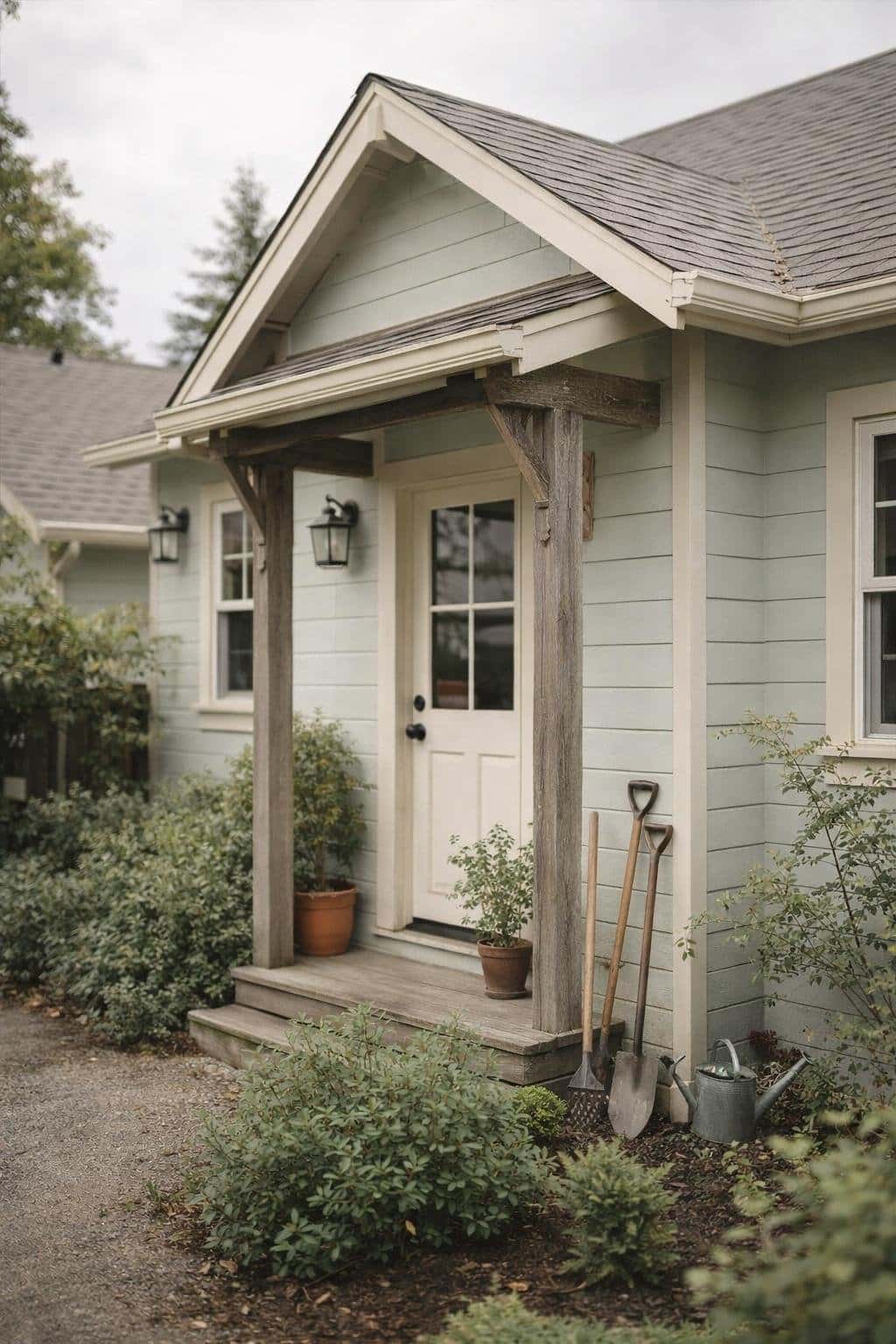
You get a warm, approachable look when you use Sea Salt on a cozy exterior style. This color works well on cottages, bungalows, and relaxed farmhouse homes where comfort matters more than polish.
Sea Salt’s soft green‑blue undertone reads calm and familiar in natural light. It avoids stark contrast and helps your home feel settled into its surroundings rather than standing apart from them.
Exterior details that pair well with Sea Salt include:
- Warm white or cream trim
- Natural wood doors or porch beams
- Stone, brick, or textured concrete foundations
- Simple black or bronze hardware
You can strengthen the lived‑in feel through layered textures. Wood siding, shingle roofs, and covered porches all support the softness of the color without competing for attention.
A small front porch or entry overhang benefits most from this palette. Sea Salt keeps the space light, while shadows and texture add depth throughout the day.
| Element | Recommended Approach |
|---|---|
| Trim | Soft white or off‑white |
| Accents | Natural wood, muted gray |
| Door | Wood stain or deep navy |
| Overall effect | Relaxed and welcoming |
Minimalist Architectural Calm
Minimalist exteriors rely on restraint, and Sea Salt supports that approach with a soft blue‑green tone grounded by gray undertones. You get color without visual noise, which helps the structure and proportions take the lead.
You can use Sea Salt on smooth stucco, fiber cement, or painted brick to maintain clean, uninterrupted surfaces. Flat or satin finishes reduce glare and keep the exterior looking intentional rather than decorative.
Why Sea Salt works for minimalist homes:
- Muted undertones prevent the color from feeling busy
- Light reflectance supports a calm, even appearance
- Neutral character pairs well with simple forms
You strengthen the look by limiting contrast. Crisp white trim, light concrete, or pale limestone keeps the palette controlled and readable.
Common pairings that stay minimal:
| Element | Color Direction |
|---|---|
| Trim | Soft white or warm off‑white |
| Roofing | Light gray or charcoal |
| Accents | Natural wood or matte black |
Warm, Sun-Washed Welcome
You get a soft, inviting exterior when you use Sea Salt on homes that receive strong daylight. The color’s green‑gray base reflects light well, which helps façades feel open without looking stark.
Sun exposure often brings out warmer green notes rather than cool blue ones.
Sea Salt works especially well on styles that rely on natural materials and relaxed proportions. You can pair it with warm trim and textured surfaces to create balance.
Exterior combinations that support a sun‑washed look include:
- Cream or off‑white trim instead of bright white
- Natural wood doors or shutters
- Light stone, brick, or stucco accents
You see strong results on these exterior styles:
- Modern farmhouse with simple lines and warm trim
- Mediterranean‑inspired homes with stucco walls and clay or concrete tile roofs
- Coastal‑influenced designs that avoid high contrast
Sea Salt adapts well as lighting shifts throughout the day. Morning light keeps the color soft, while afternoon sun pulls forward its green undertones.
This change adds depth without making the exterior feel inconsistent.
You can increase warmth by choosing finishes carefully.
| Element | Recommended Direction |
|---|---|
| Trim color | Soft white or warm cream |
| Roof | Medium gray, brown, or weathered tones |
| Hardware | Bronze, blackened steel, or wood |
Elegant Evening Refinement
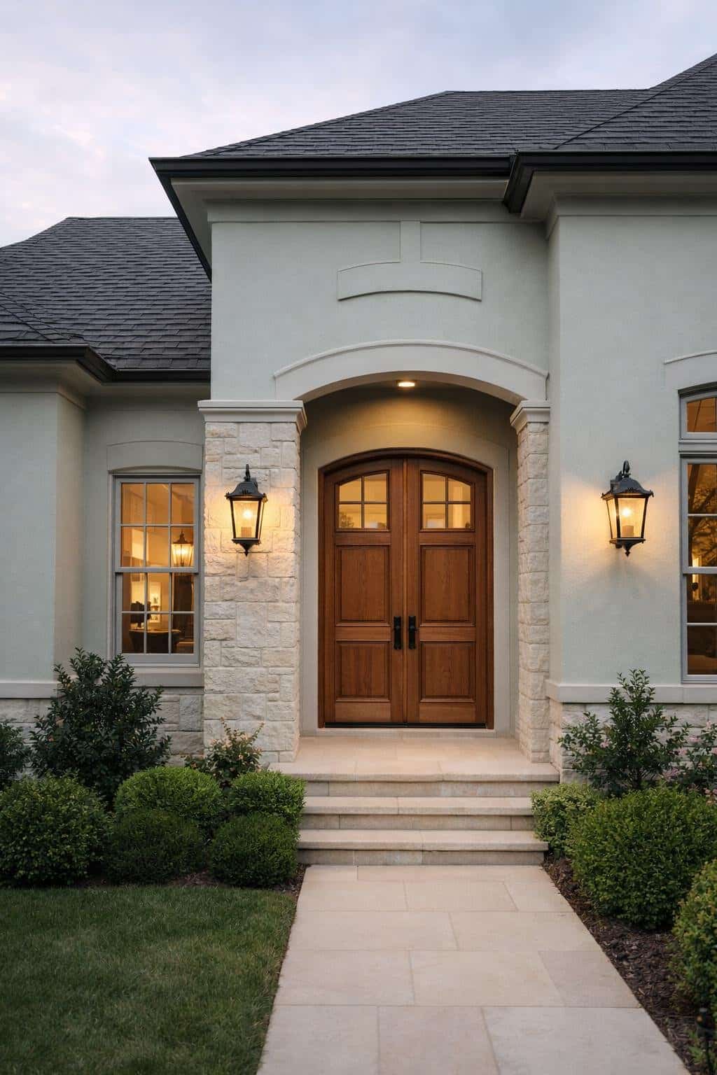
You see Sea Salt take on a deeper, more refined character as daylight fades.
Exterior lighting draws out its gray-green undertones, which read calmer and more composed in the evening.
This shift works especially well when you want your home to feel polished rather than bold after dark.
You strengthen this effect by pairing Sea Salt with restrained, low-sheen finishes.
Satin or low-luster paints limit glare and keep surfaces visually smooth under porch and landscape lights.
Simple trim colors, such as soft whites or light grays, support the look without sharp contrast.
You can guide the mood with deliberate material choices:
- Metal accents: Brushed nickel or dark bronze fixtures add quiet contrast.
- Natural stone: Cooler stone tones reinforce the paint’s muted palette.
- Wood details: Light to medium stains keep the exterior balanced.
You also control how Sea Salt reads at night through lighting temperature.
Warm white bulbs soften the color and reduce its blue notes, while neutral white light keeps it crisp and modern.
Spacing lights evenly prevents harsh shadows that can distort the hue.