Picking a front door color really sets the vibe for your place. Agreeable Gray strikes a nice middle ground—warm, stylish, not too showy, not too boring. It creates a welcoming entry that feels timeless and pairs well with tons of different accents.
With a little creativity, you can make this neutral shade work for both classic and modern looks. Whether you go with a simple painted door or something framed with stone and cozy details, Agreeable Gray flexes to fit your entryway.
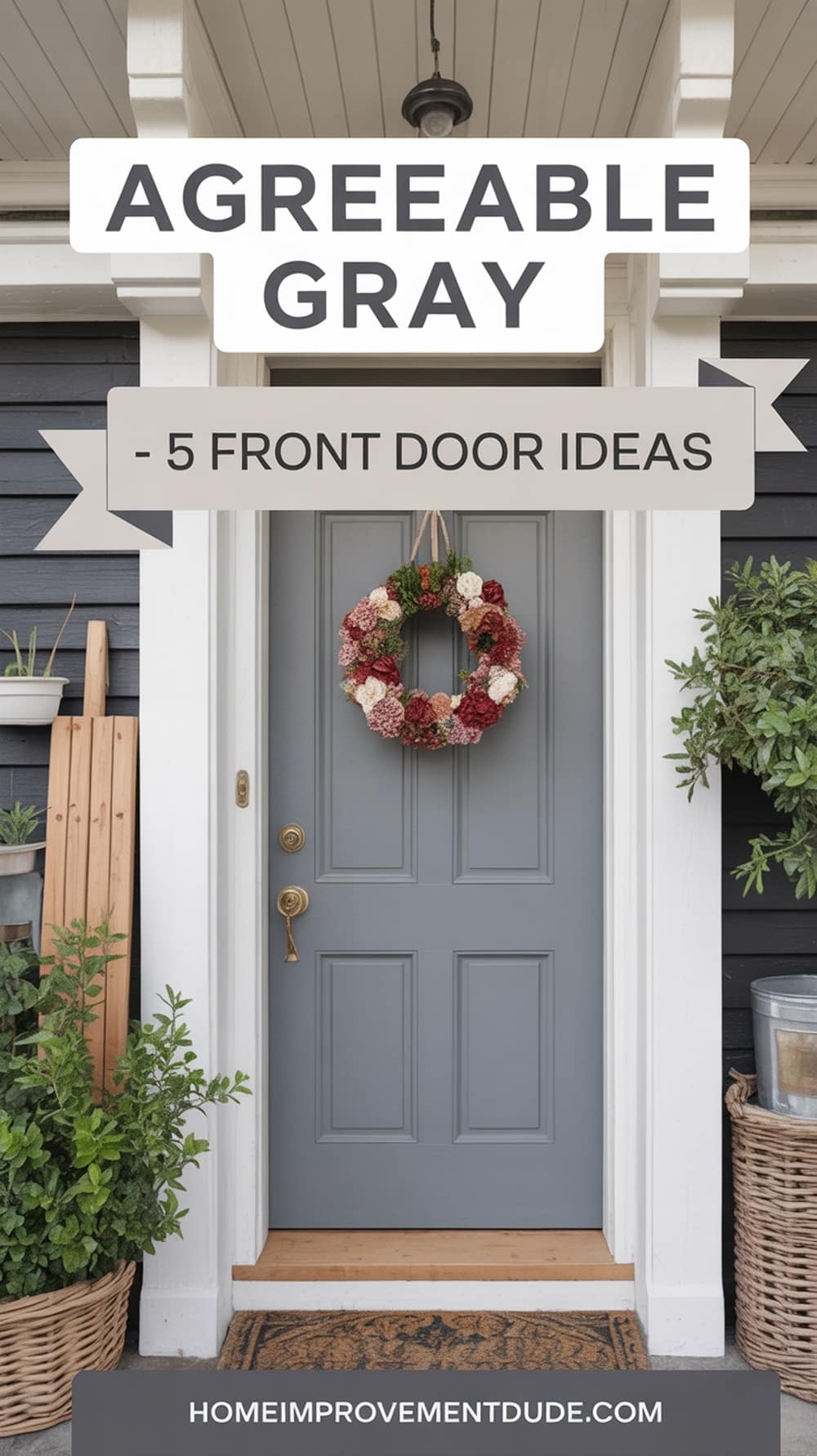
Agreeable Gray Front Door
An Agreeable Gray front door gives your home a soft, neutral look that feels inviting. Gray and beige blend here, so you get a shade that’s easy to match with almost anything.
Put Agreeable Gray next to white trim and you’ll notice the contrast—it’s clean and crisp. The white trim makes the door pop but still keeps things understated.
If your house has charcoal siding, this lighter gray acts as a subtle accent. It softens the dark exterior and warms things up just enough.
Try updating the look with black or brushed nickel hardware. Those finishes highlight the door and pull the whole entry together.
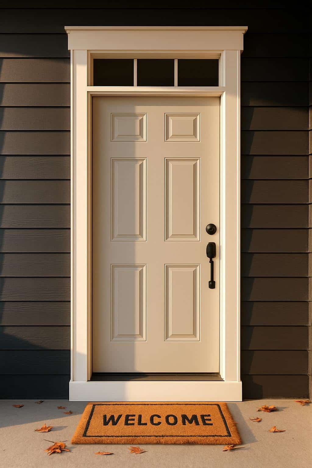
Classic Front Door
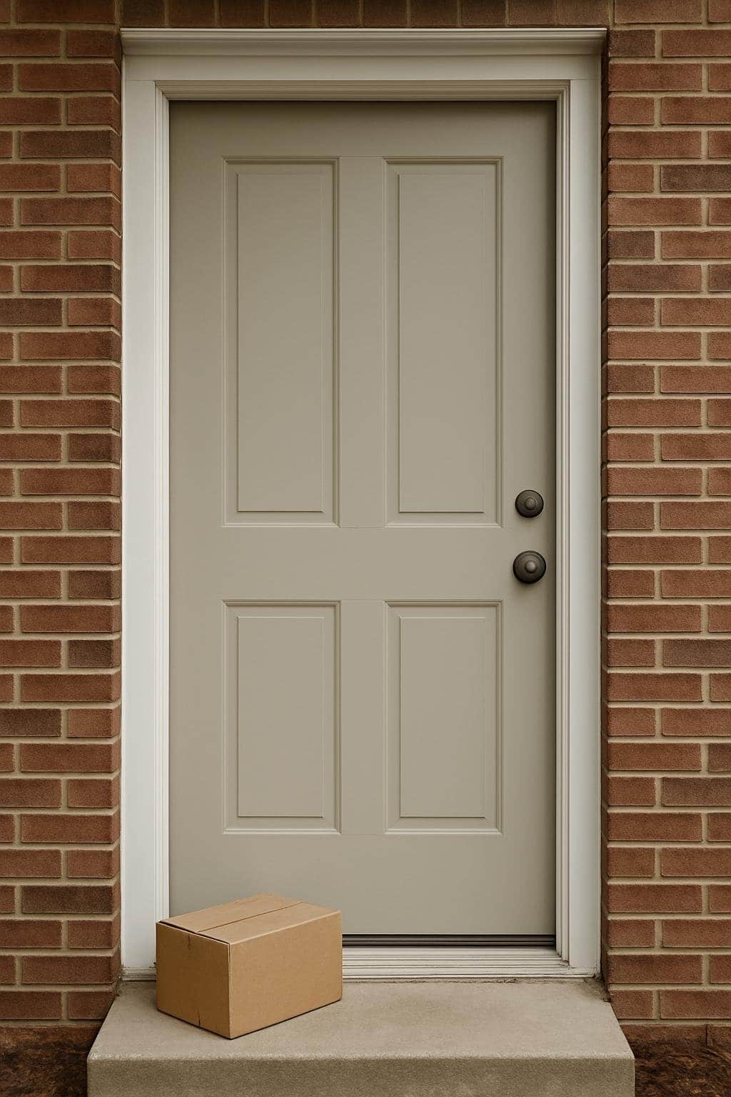
A classic door in Agreeable Gray looks right at home with white trim and red brick. The soft gray blends into the brick, while crisp white trim frames everything. This combo just feels right—balanced and timeless.
Keep the door design simple with clean panels or subtle molding. A traditional door in this shade welcomes guests without shouting for attention. Plus, it’s neutral enough to swap out wreaths or seasonal decorations whenever you feel like it.
Adding polished hardware—maybe brass or black—gives the door some personality. Little details like these stand out against the gray. A classic Agreeable Gray door helps your home look neat and inviting all year.
Regular Agreeable Gray Front Door
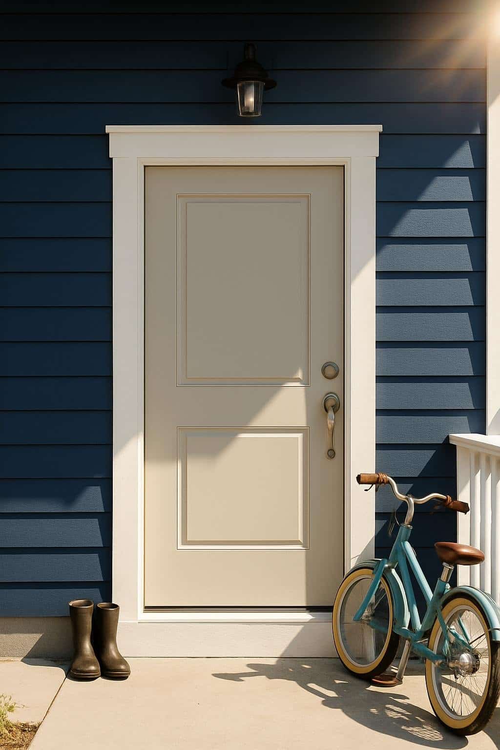
A regular Agreeable Gray front door brings a calm, balanced vibe. The soft greige tone works if you want something neutral but not too plain. It’s inviting but doesn’t scream for attention.
If you pair this door with navy blue siding, you get a sharp, clean contrast. The dark siding makes the lighter door pop, but the overall look stays simple.
Bright white trim around the door sharpens things even more. The white frames the gray, making it feel fresh and defined. You end up with a tidy entrance that fits all kinds of homes.
You don’t need a bunch of extras here. The color combo alone gives your entry a polished, welcoming feel.
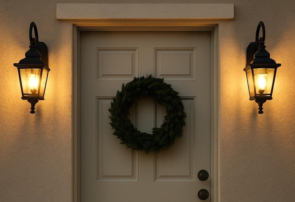
Warm and Welcoming
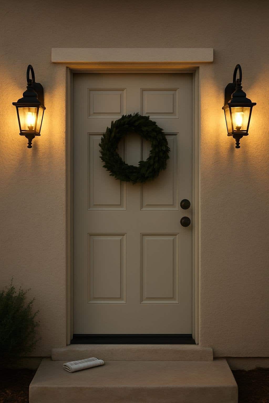
Pairing an Agreeable Gray front door with stucco creates a soft, balanced entry. The warm undertone of the gray blends into the natural texture of stucco, giving your entry a calm, inviting feel.
Lantern-style lighting on either side of the door makes things even cozier. The glow brings out the gray and adds some warmth in the evenings.
Go with black or bronze lanterns for a classic vibe, or brushed nickel if you want a lighter touch. All of them work with Agreeable Gray and help your door stand out without going overboard.
Add a potted plant or a simple doormat to finish it off. These small touches make your front entry feel approachable every time you come home.
Stone-Framed Front Door
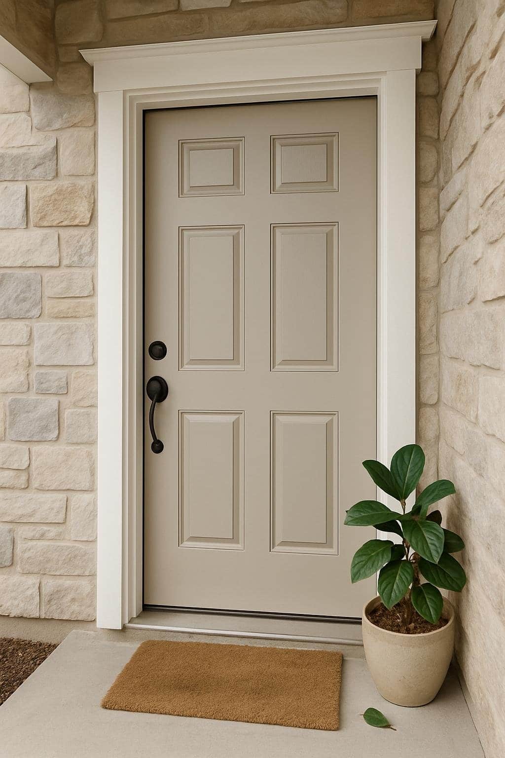
A stone-framed front door brings in natural texture and depth. If you paint your door Agreeable Gray, the soft neutral matches up with earthy stone. The mix of warm and cool shades makes the entry feel balanced and welcoming.
Pick stones with different tones—light grays, tans, soft browns—to highlight the warmth in the door. This combo feels calm and never too bold.
Crisp white trim helps define the doorway. The contrast between white trim, gray door, and stone frame keeps things looking polished and tidy. The door really stands out against the textured background.
Simple black or bronze hardware finishes the look. These details tie the paint and stone together without fuss. The whole effect stays simple and classic.
Why Choose Agreeable Gray for Your Front Door?
Agreeable Gray just works on front doors. It’s warm, neutral, and helps your entry feel friendly while blending with all sorts of exterior finishes.
Curb Appeal Benefits
The front door is usually the first thing people notice, and color matters a lot. Agreeable Gray gives you a soft, approachable tone—not too bold, not too plain.
This shade pairs easily with stone, brick, or wood. Instead of fighting with strong textures, it softens them and keeps things balanced. If your garden’s colorful or your shutters are bold, the gray won’t compete—it lets everything else shine.
Lighting changes how your front door looks throughout the day. In bright sun, Agreeable Gray looks lighter and airy. In the shade, it warms up a bit, so your entry never feels flat. This little shift adds depth and keeps things interesting.
Honestly, it’s a safe choice if you want to update your curb appeal without taking a wild design risk.
Versatility With Home Styles
Agreeable Gray fits so many architectural styles. Whether you’ve got a traditional brick house, a modern farmhouse, or a beachy cottage, it blends right in.
For classic homes, it gives a neutral backdrop that lets trim and hardware stand out. On modern places, it’s a soft contrast against white siding or black windows. If your house has a mix of textures—stucco, stone, whatever—this color ties it all together.
You can pair it with a bunch of accent colors. For example:
- Navy blue shutters for a bold contrast
- Warm beige siding for a seamless, soft look
- Crisp white trim for a clean, fresh finish
This flexibility makes it easy to switch up your entry over time. Change the hardware, add new lighting, or redo landscaping—your door color will still work.
Coordinating Colors and Accents
If you go with Agreeable Gray for your front door, the details around it can shift the vibe—warmer, cooler, or just more balanced. The right trim, hardware, and porch accents make the entryway feel finished and inviting.
Trim and Hardware Pairings
Your trim color really changes how Agreeable Gray looks. Crisp white trim pops and feels modern. If you want something softer, off-white or cream trim blends gently. For a bolder look, black trim gives sharp definition and a modern edge.
Hardware matters, too. Matte black handles and hinges are sleek and work with most trim. Brushed nickel is subtle and cool-toned, while oil-rubbed bronze adds a bit of warmth.
Here’s a quick guide:
| Trim Color | Hardware Finish | Style Effect |
|---|---|---|
| White | Matte Black | Clean, modern |
| Cream | Brushed Nickel | Soft, balanced |
| Black | Bronze | Bold, classic |
The right mix makes your front door look intentional instead of like an afterthought.
Complementary Porch Decor
Your porch decor can highlight Agreeable Gray without overpowering it. Try deep navy or forest green planters for a bit of contrast and richness.
If you’re after a lighter vibe, soft blues or muted terracotta pots keep things casual and inviting.
Textiles matter too. A striped doormat in black and white brings sharp contrast.
On the other hand, a natural jute rug gives off warmth. Seasonal wreaths—think greenery, eucalyptus, or neutral florals—keep your door looking fresh without clashing.
Lighting really ties everything together. I love how black lantern sconces frame the door and add structure.
If you prefer something more understated, brushed nickel fixtures keep the vibe simple. Sticking to one finish helps the entry feel cohesive instead of mismatched.