Picking a paint color for your home can get overwhelming, right? Some shades, though, just make things easier. Agreeable Gray by Sherwin Williams stands out because it brings both warmth and versatility, fitting into so many different styles.
You can use this neutral tone to create a look that’s balanced, timeless, and easy to match with other colors.
If you lean toward a cozy farmhouse, a modern setup, or a classic suburban vibe, this color just adapts. It fits in single-story and two-story homes, too, so you’ve got options no matter your layout.
Let’s look at some ways to bring Agreeable Gray into your home and how to match it with finishes and accents that actually work.
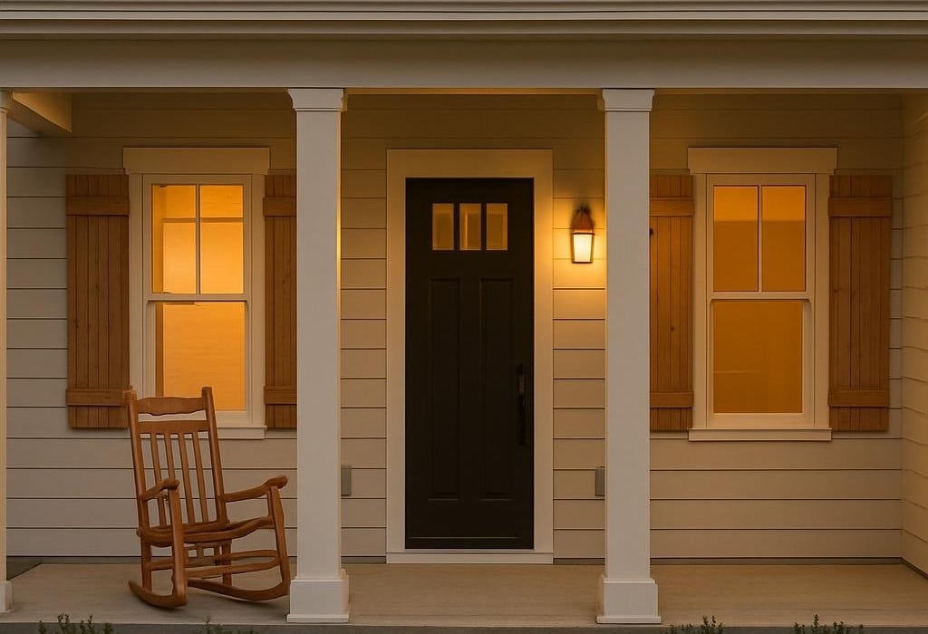
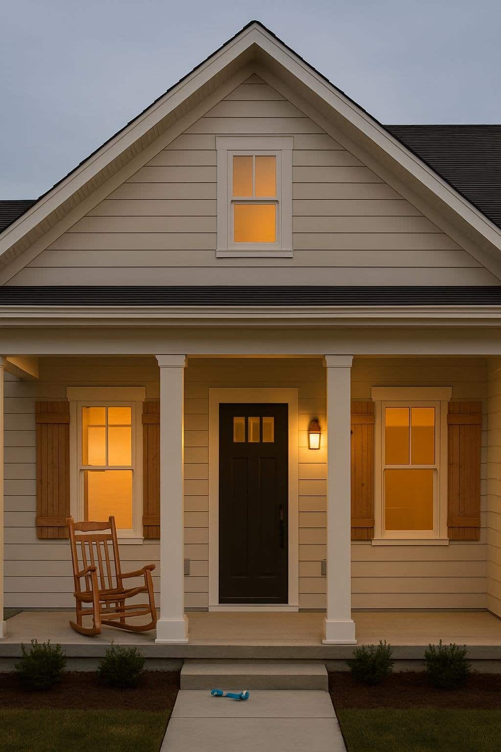
Farmhouse
For a farmhouse look, Agreeable Gray brings warmth without being boring. It goes well with natural textures—think wood, stone, or brick, all staples in farmhouse design.
Try painting your exterior in Agreeable Gray and use crisp white for the trim. That combo keeps things looking clean but still cozy and inviting.
Want a bit of color? Add navy shutters for a subtle pop. The contrast makes your windows stand out without losing that farmhouse feel.
Finish things off with farmhouse touches like a metal roof accent, wooden porch beams, or maybe a shiplap entry. These details blend perfectly with the gray palette and amp up the rustic-modern vibe.
Suburban
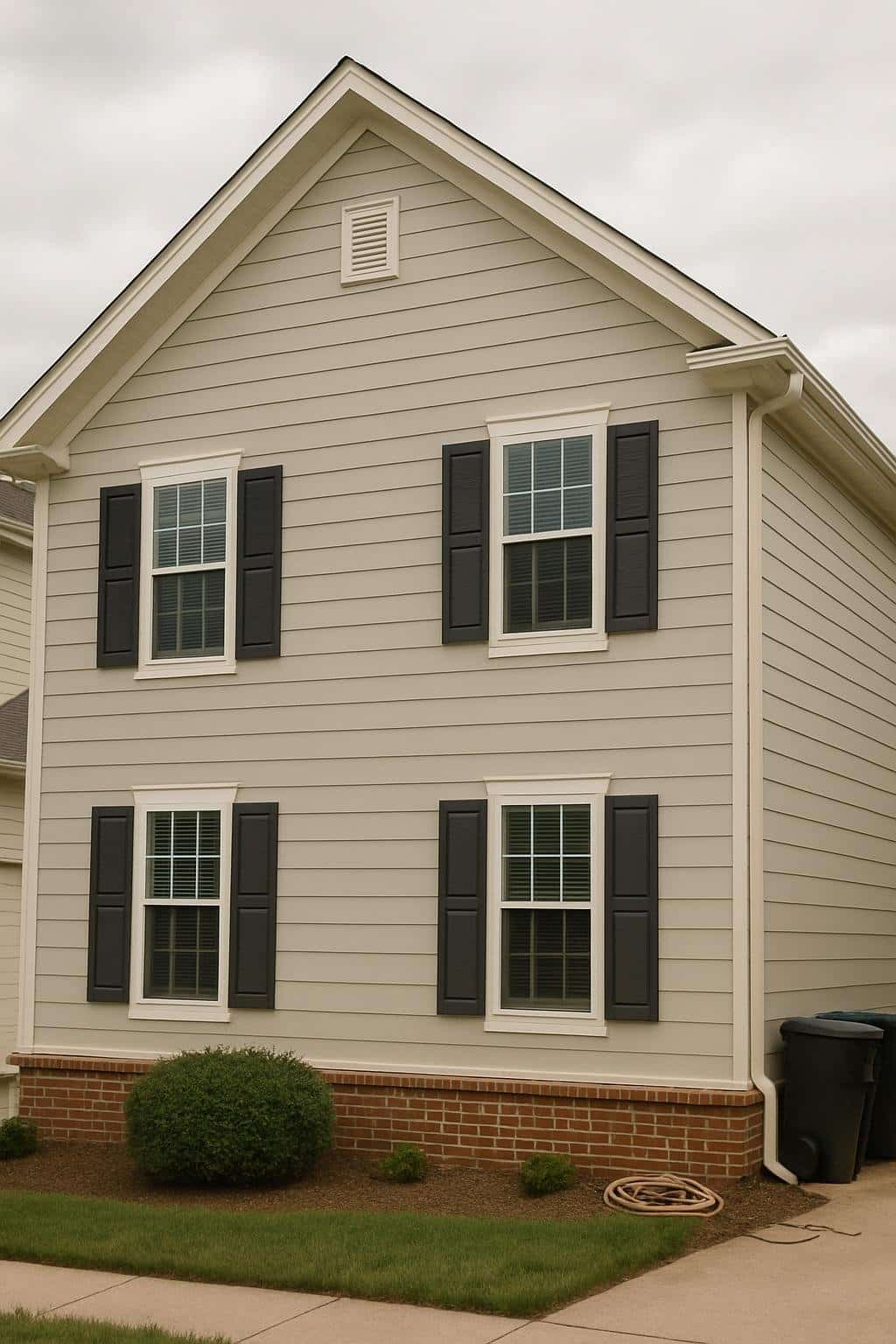
In suburbia, Agreeable Gray gives off a calm and welcoming energy. The soft gray blends right in with tree-lined streets and big yards, making your house feel like it belongs.
Pair Agreeable Gray siding with charcoal shutters for a nice contrast. The darker trim frames your windows and doors, adding definition without being too loud.
Red brick accents bring in warmth and some personality. The brick looks great around the foundation, entryway, or porch, giving a classic touch that still feels fresh.
This mix of gray, charcoal, and brick helps your house stand out just enough. It’s a straightforward way to boost curb appeal and keep things timeless.
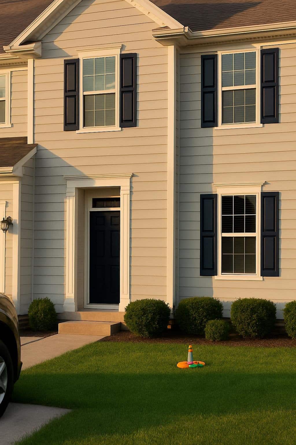
Two-Story
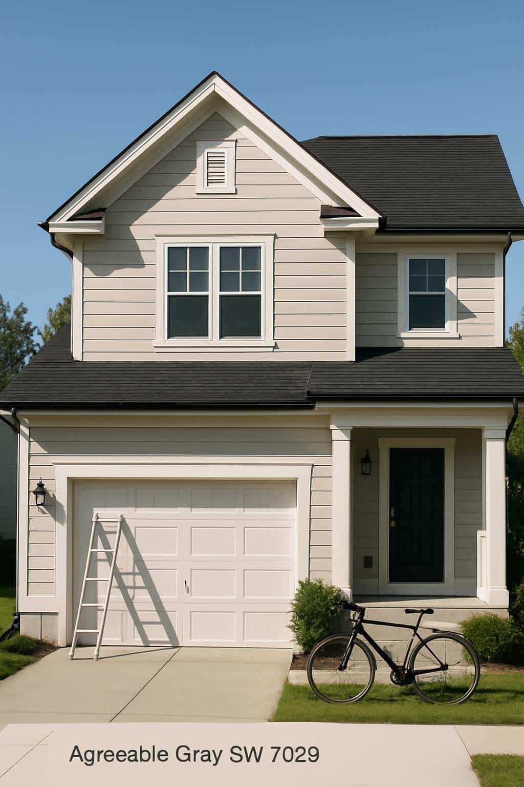
Agreeable Gray on a two-story house creates balance and a welcoming vibe. The soft gray tone covers big areas without feeling heavy, so the exterior stays light but interesting.
White trim highlights windows, doors, and rooflines. The crisp contrast brings out the details and gives your home a sharp finish.
A black roof adds another layer of contrast. It grounds the look and makes the lighter colors pop, which works especially well on taller homes by drawing your eyes upward.
If you want a simple, polished two-story, this color mix is easy to live with and maintain. It’s a blend of classic neutrals that feels modern but not over-the-top. You end up with a timeless look that works for all sorts of styles.
Modern
Agreeable Gray on a modern home creates a clean, balanced exterior. The soft tone pairs well with sharp lines and simple shapes, giving you a fresh style that isn’t too trendy.
Try crisp white trim to make windows and doors pop. That contrast keeps things interesting but not overwhelming.
If you want extra warmth, go for natural wood shutters against the gray siding. The mix softens modern lines and keeps the design feeling up-to-date.
Black accents—like a front door or metal lights—add a modern edge. These details keep the look inviting and give just enough attitude.
Choosing this color gives you a flexible base for different modern design ideas. It’s simple, but you still get room to play with textures and accent colors.
Traditional
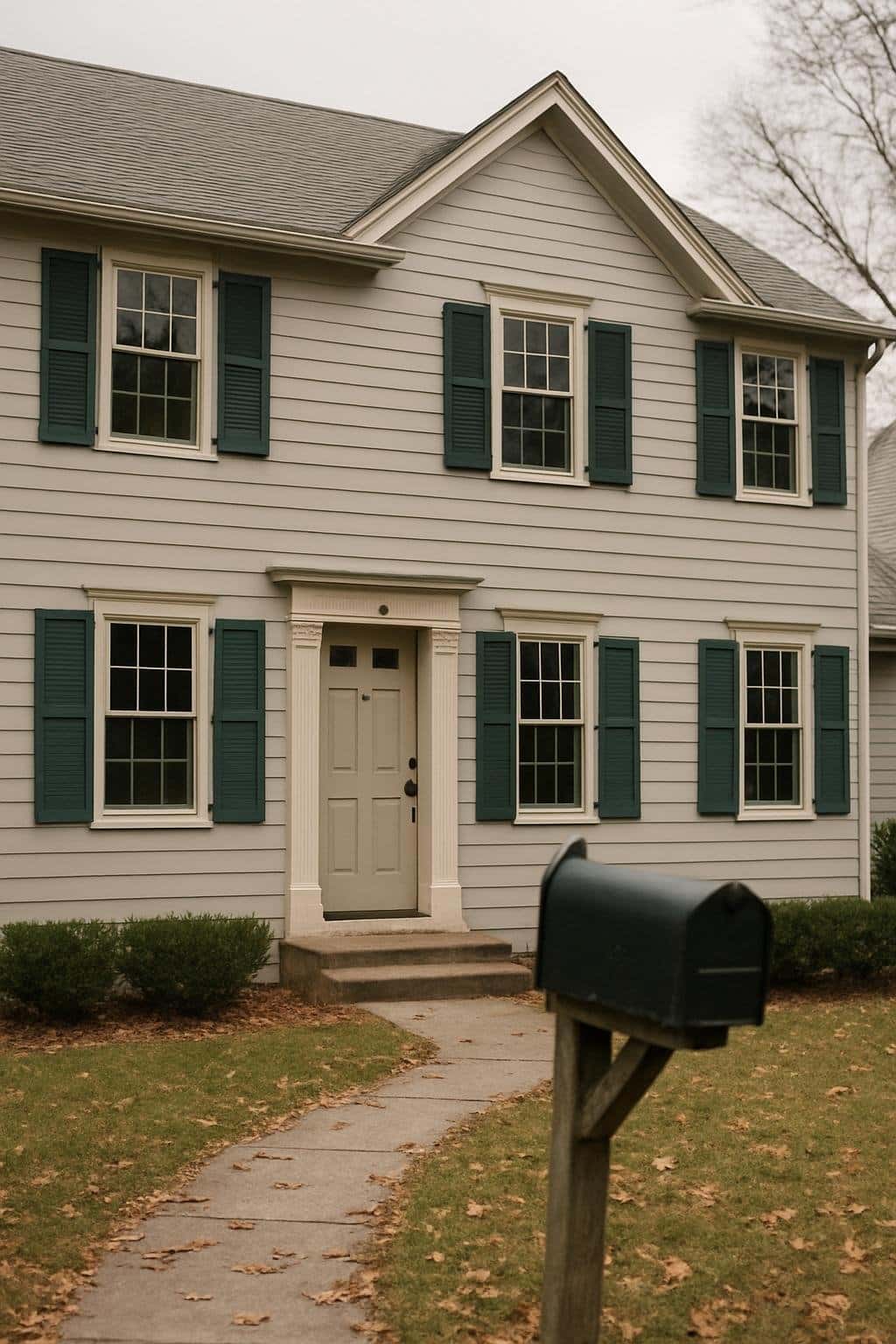
Pairing Agreeable Gray siding with deep green shutters gives your home a timeless, classic look. The cool gray feels calm, and the green accents add warmth and a hint of tradition.
Beige trim around windows and doors softens the contrast, creating balance and showing off architectural details without being too dramatic.
For traditional style fans, this palette works with brick steps, wood doors, or simple landscaping. The colors just fit, making the house feel grounded and welcoming.
You can even use Agreeable Gray inside, pairing it with natural wood furniture. Green and beige accents work well through fabrics, art, or rugs, carrying the look throughout your home.
Why Choose Agreeable Gray for Your Home?
This paint color mixes gray and beige, giving you a neutral shade that plays nice with tons of styles. It’s easy to match with furniture, flooring, and trim—no clashing headaches here.
Benefits of Agreeable Gray
Agreeable Gray is flexible because it’s got both warm and cool vibes. This greige tone fits into modern, traditional, or farmhouse designs. Use it in bedrooms, living rooms, kitchens, or hallways—it never really feels out of place.
Decorating gets easier, too. Pair it with white trim for a crisp feel, or with wood finishes for more warmth. Soft blues, greens, or muted earth tones work great as accents.
This shade won’t make small rooms feel cramped, unlike some darker grays. Instead, it offers a clean backdrop that feels open and bright. If you want one color to tie your home together, this one’s a strong contender.
How Lighting Affects Agreeable Gray
Lighting really changes how this color looks. In rooms with natural sunlight, it leans beige and feels warmer. In low light or north-facing rooms, it can look more gray and a bit cooler.
You might notice it shifts throughout the day. Morning light brings out softness and warmth, but by evening, cooler tones show up. That’s just part of its charm—and honestly, part of what makes it so versatile.
Before you commit, test a sample on different walls. Check it under natural daylight, artificial light, and at night. It’s the best way to see how the color will actually behave in your space.
Coordinating Colors and Finishes
You can make Agreeable Gray feel brighter, cozier, or more modern depending on what you pair with it. The right trim, accents, and floors make your rooms feel balanced and welcoming.
Best Trim and Accent Colors
Crisp white trim is a go-to with Agreeable Gray, highlighting its soft undertones without any weird clashes. Sherwin-Williams Pure White or Extra White both work well for baseboards, doors, and crown molding. These shades help the walls stay looking fresh.
For accents, try deep navy, charcoal, or black for some punch. These darker tones look great on doors, built-ins, or furniture, giving your space a modern touch without taking over.
If you want a gentler look, use muted blues, greens, or taupes. These colors bring out the warmth in the gray and create a calm atmosphere. Light beige or cream accents also blend in nicely if you prefer a softer, low-contrast style.
Here’s a quick accent guide:
- Crisp White – clean trim and doors
- Navy/Charcoal – bold contrast
- Soft Blue/Green – calming accents
- Cream/Beige – subtle warmth
Flooring and Material Pairings
Agreeable Gray works with both light and dark flooring. The mood of the room shifts depending on what you choose.
Light oak or natural wood floors make everything feel airy and open. On the other hand, dark walnut or espresso tones create richness and depth.
If you like tile, try warm beige, travertine, or light gray stone. These choices blend in easily and bring in a bit of texture.
Want a modern vibe? Matte black or slate tile looks sharp in smaller spots like bathrooms or laundry rooms.
Metal finishes can really shift the style. Brushed nickel and chrome lean clean and modern.
If you’re after warmth and character, oil-rubbed bronze or brass might do the trick. Mixing metals is totally possible—just keep the tones consistent for lighting, hardware, and fixtures.
When it comes to rugs, stick with neutral patterns or subtle textures. That way, the wall color stands out but you still get comfort and a little visual interest.