Choosing the right paint color can shape the entire mood of your living room. Agreeable Gray by Sherwin Williams has become a popular choice because it blends warmth and softness in a way that feels inviting without being overwhelming. You get a neutral backdrop that works with many styles, from cozy and relaxed to modern and elegant.
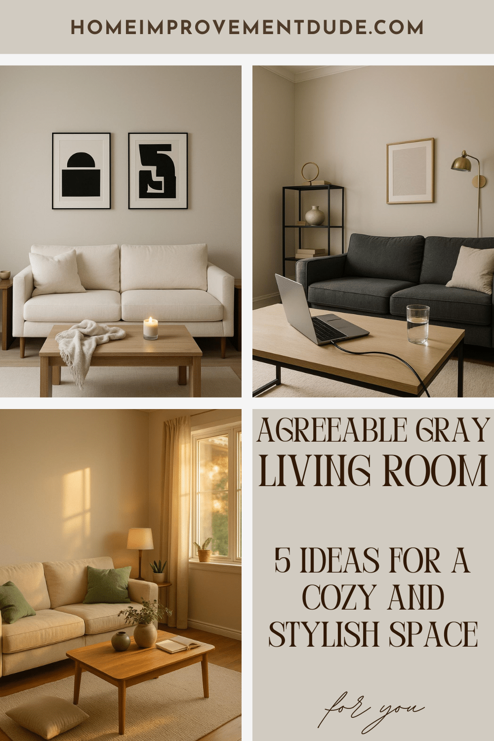
With the right accents and textures, you can make this shade feel fresh and personal. Whether you want to keep things simple and minimalist or add layers of comfort and charm, Agreeable Gray gives you the flexibility to design a space that feels like home.
Jute Rug
A jute rug works well with Agreeable Gray walls because its natural texture adds warmth to the space. The soft, earthy tones of jute balance the cool undertone of gray, making the room feel more inviting.
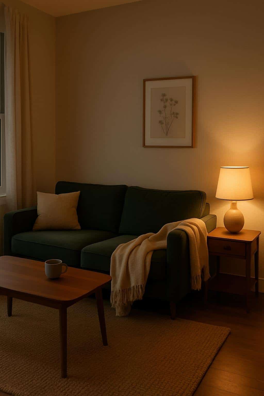
When you pair a forest green sofa with a jute rug, the mix of colors feels grounded and calm. The green stands out as a bold accent, while the rug keeps the overall look relaxed and natural.
You can place a large jute rug under your seating area to anchor the sofa and coffee table. This helps define the space and gives your living room a cozy, layered feel.
Because jute rugs come in simple designs, they don’t compete with your furniture. Instead, they highlight the textures and colors already in your room, especially the contrast between the green sofa and the gray walls.
If you want a softer touch underfoot, you can layer a smaller patterned rug on top of the jute. This adds comfort while keeping the natural style that jute brings to your living room.
Elegant
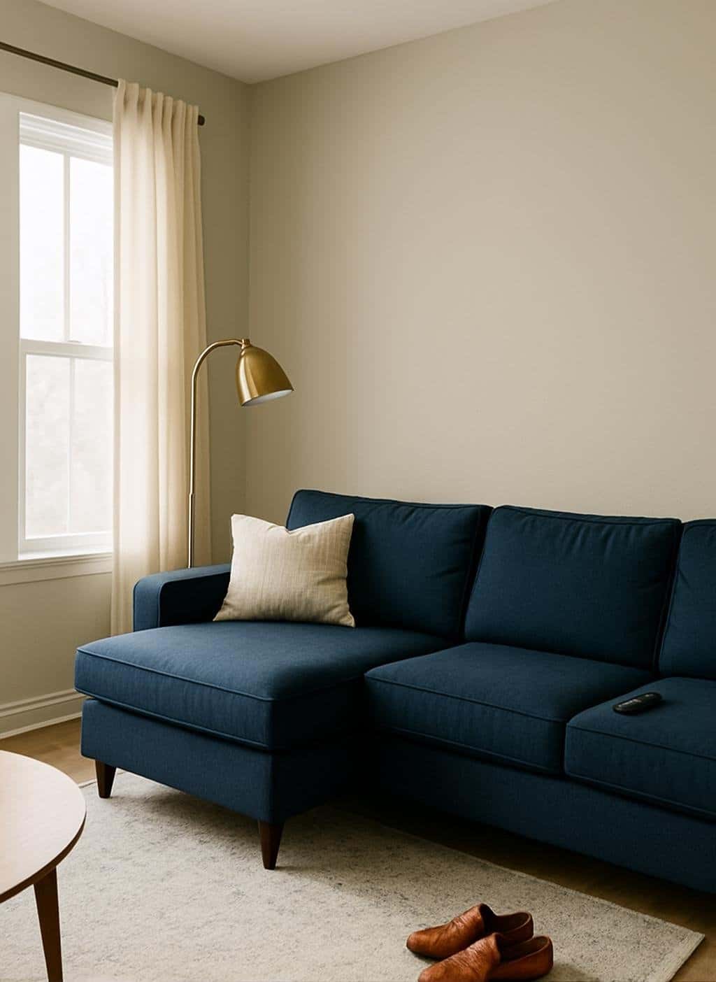
You can create an elegant look by pairing Agreeable Gray walls with a navy sectional. The deep blue adds contrast while the soft gray keeps the room calm and balanced. This mix feels polished without being too formal.
Add a brass lamp to bring a warm metallic accent. The subtle shine of brass works well against both the gray walls and the navy seating. It also adds a touch of sophistication without overwhelming the space.
Keep the rest of your décor simple so the main pieces stand out. Neutral rugs, clean-lined tables, and minimal accessories let the color and texture do the work. This approach makes the room feel refined yet comfortable.
If you want to soften the look, layer in light fabrics like cream or beige throw pillows. These tones blend easily with Agreeable Gray and help brighten the space. Small details like this can make the room feel complete.
Cozy
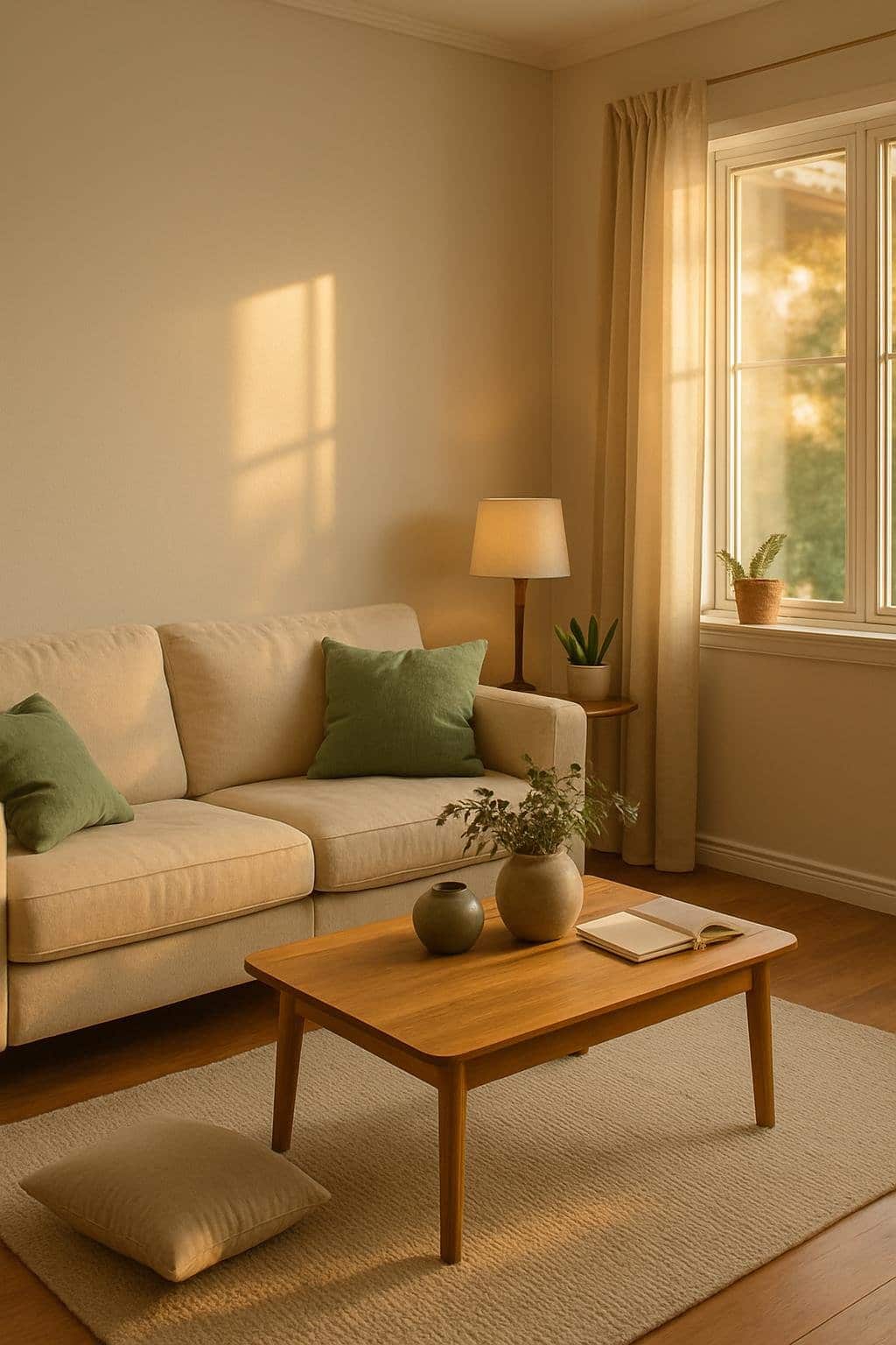
You can create a warm and welcoming space by painting your walls in Agreeable Gray. This soft shade adds a gentle backdrop that works well with many styles. It feels calm without making the room look flat.
Pair your walls with a beige sofa to bring in extra warmth. The lighter tone of the sofa balances the gray walls and keeps the room from feeling too cool. This mix makes the space feel inviting for everyday use.
Green accents, like throw pillows or a small plant, add a touch of freshness. The natural color blends nicely with both beige and gray, giving your room a cozy but lively feel. Even a single leafy plant can make a big difference.
Keep your furniture simple and comfortable. A soft rug under the sofa or a wooden coffee table can add texture without overwhelming the space. These small details help your living room feel relaxed and easy to enjoy.
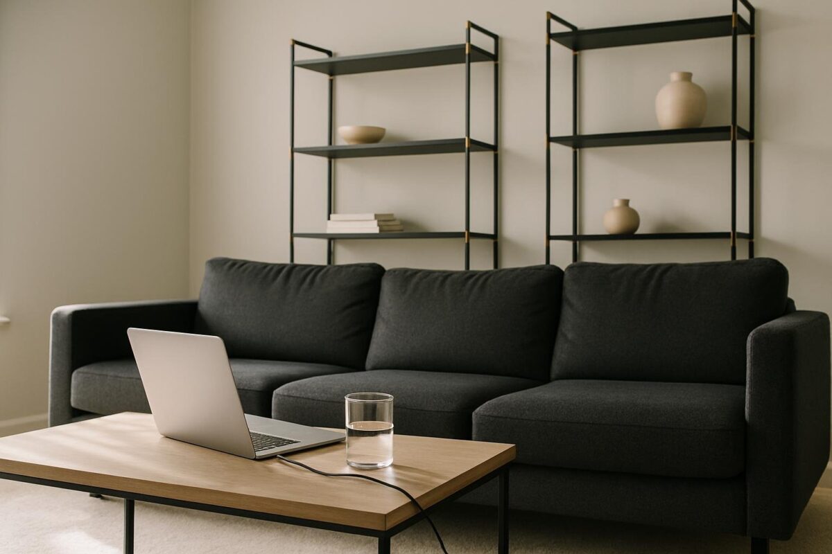
Modern
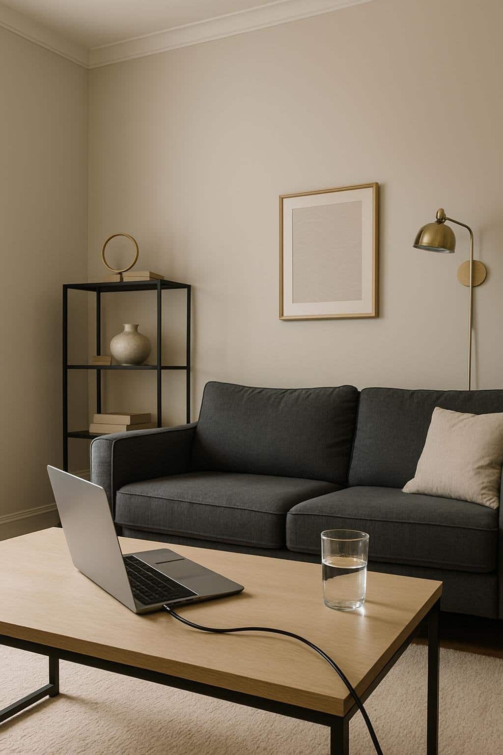
You can give your living room a modern look by pairing Agreeable Gray walls with a charcoal sectional. The darker sofa creates contrast while the warm gray paint keeps the space from feeling cold. This mix feels clean and balanced without being overwhelming.
Add brass details to bring in a touch of shine. A brass floor lamp, side table, or picture frame can break up the neutral tones and add warmth. These small accents make the room feel polished without taking away from the simple color scheme.
Keep the rest of your furniture and decor minimal. Choose sleek coffee tables, simple rugs, and uncluttered shelves. This helps the gray walls and charcoal sectional stand out while letting the brass details add just enough style.
If you want more depth, layer in textures like a soft throw blanket or a woven rug. These touches can make the modern design feel comfortable and inviting while still looking fresh and up to date.
Minimalist
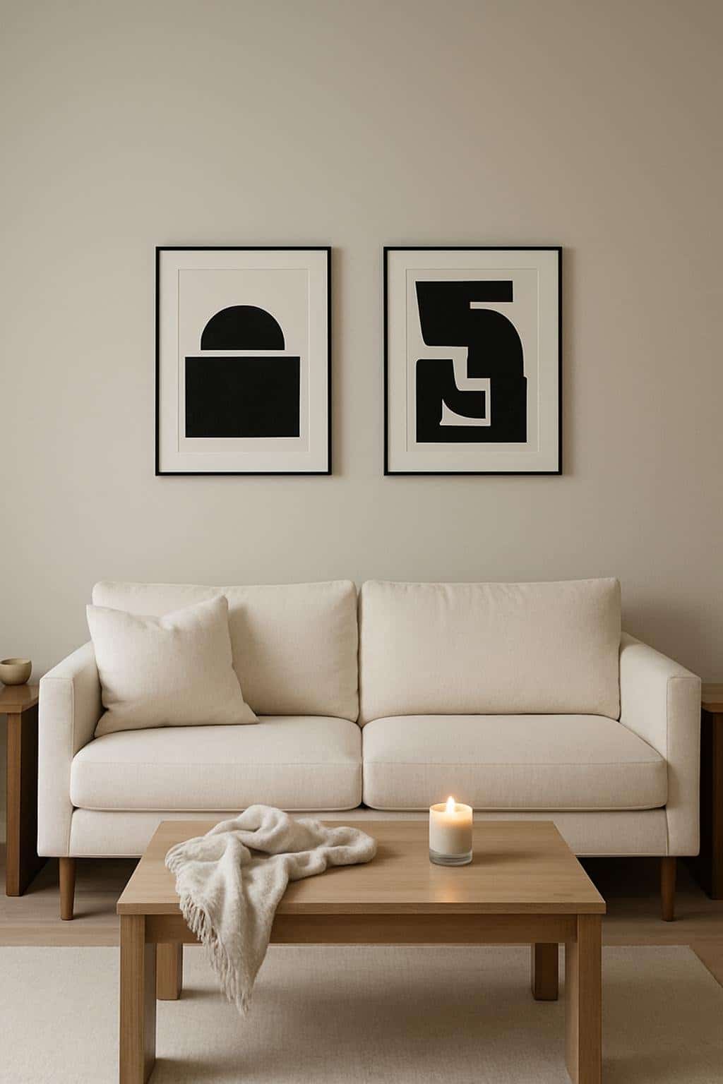
A minimalist living room works well with Agreeable Gray walls because the color feels soft and balanced. It gives you a neutral backdrop that doesn’t compete with your furniture or decor.
Pair your walls with a cream sofa to keep the space light and welcoming. The warm tone of the sofa softens the gray and makes the room feel more comfortable without adding clutter.
Add black-and-white artwork to bring in clean contrast. This keeps the design simple while giving your space a modern touch. The artwork stands out against the gray walls without overwhelming the room.
Keep accessories to a minimum so the focus stays on the main pieces. A few well-chosen items, like a small side table or a textured rug, can add interest without breaking the minimalist look.
With these choices, you create a calm space that feels open and easy to enjoy.
Why Agreeable Gray Is a Top Choice for Living Rooms
This paint color blends gray and beige, giving you a flexible backdrop that works with many styles. It helps your room feel calm, balanced, and inviting without overpowering other design choices.
The Psychology of Neutral Paint Colors
Neutral colors like gray and beige create a sense of stability in a space. When you use a balanced shade such as Agreeable Gray, you set a mood that feels both relaxed and welcoming.
This is especially helpful in living rooms, where you spend time with family or host guests. A neutral color keeps the atmosphere light and comfortable without distracting from furniture, art, or décor.
Agreeable Gray also avoids the cold feeling that some grays can bring. Because it has warm undertones, it feels softer and more approachable. This makes it easier for you to pair with both warm and cool accent colors.
You can use it with wood tones, metals, or fabrics without worrying about clashing. That flexibility saves you time and effort when decorating or updating your space.
How Agreeable Gray Enhances Natural Light
Lighting changes how paint looks, and Agreeable Gray adapts well in many conditions. In bright rooms with lots of natural sunlight, the color looks airy and fresh. It reflects enough light to keep the space open but doesn’t feel stark or washed out.
In rooms with moderate light, the warm beige undertones become more noticeable. This helps the space feel cozy instead of dull. You’ll notice how it adds depth without making the walls look heavy.
If your living room doesn’t get much natural light, the shade can look slightly different. It may show faint violet undertones, so it’s best to test a sample first. This step ensures you get the exact look you want in your space.
Because of its balance, Agreeable Gray works across different lighting setups, making it a reliable choice for most living rooms.
Coordinating Decor and Accents With Agreeable Gray
This versatile color works best when you balance it with furniture shades that highlight its warmth, accent walls that create contrast, and textures that keep the room from feeling flat. Small details like fabrics, finishes, and natural materials can make a big difference in how the space feels.
Choosing Complementary Furniture Colors
Your furniture sets the tone for how Agreeable Gray looks in the room. Softer neutrals like white, cream, and beige keep the space light and airy. If you want contrast, try charcoal, navy, or deep green pieces to add depth without overwhelming the gray walls.
Wood finishes pair especially well. Light oak creates a warm, casual look, while dark walnut feels more formal and polished. Upholstery in muted tones like soft blue or dusty rose can bring in color without clashing.
For a quick guide, think of this balance:
| Furniture Color | Effect With Agreeable Gray |
|---|---|
| White / Cream | Clean and bright |
| Navy / Charcoal | Bold contrast |
| Light Oak | Warm and natural |
| Dark Walnut | Classic and rich |
Mixing these tones helps you keep the room cohesive while still adding personality.
Accent Wall Ideas
An accent wall can make Agreeable Gray stand out. You could paint one wall a deeper shade like Sherwin Williams Naval or Iron Ore for a dramatic look. These darker colors highlight the lighter gray and give the room a focal point.
If you prefer softer contrast, consider pale blues, sage greens, or warm taupes. These colors blend well with Agreeable Gray’s undertones and create a calm atmosphere.
You don’t have to limit yourself to paint. A wall with wood paneling, stone veneer, or patterned wallpaper can also work as an accent. This approach adds variety without needing bold colors.
Incorporating Textures for Depth
Agreeable Gray can look flat if the room lacks texture. Adding different materials keeps the space interesting. Use woven baskets, linen curtains, or chunky knit throws to add softness and warmth.
Metal accents like brushed nickel or matte black bring a modern edge. Natural elements such as wood beams, jute rugs, or stone decor make the color feel grounded and inviting.
Layering textures works best when you mix smooth and rough surfaces. For example, pair a sleek leather sofa with a soft wool rug, or combine a glass coffee table with a rustic wood side table. This balance makes the gray walls feel more dynamic.